Assignment 7 Notes
1. Election Results
The votes for Iowa and nearby states:
library(dplyr)
library(ggplot2)
election2020 <- read.csv("election2020.csv")
state_abb <- data.frame(state = state.name, abb = state.abb)
election <- left_join(election2020, state_abb, "state")
nearby_states <- c("IA", "IL", "WI", "MN", "SD", "MO", "NE")
election_nearby <- filter(election, abb %in% nearby_states) |>
    mutate(candidate = factor(candidate, c("Biden", "Other", "Trump")))

select(election_nearby, state, candidate, votes) |>
    tidyr::pivot_wider(names_from = "candidate", values_from = "votes") |>
    gt::gt() |>
gt::fmt_integer()| state | Biden | Other | Trump |
|---|---|---|---|
| Illinois | 3,471,915 | 114,937 | 2,446,891 |
| Iowa | 759,061 | 43,397 | 897,672 |
| Minnesota | 1,717,077 | 76,029 | 1,484,065 |
| Missouri | 1,253,014 | 54,212 | 1,718,736 |
| Nebraska | 374,583 | 24,954 | 556,846 |
| South Dakota | 150,471 | 11,095 | 261,043 |
| Wisconsin | 1,630,866 | 56,991 | 1,610,184 |
The three plots:
p <- ggplot(election_nearby, aes(x = state, y = votes, fill = candidate)) +
    scale_fill_manual(values = c(Trump = scales::muted("red"),
                                 Biden = scales::muted("blue"),
                                 Other = "grey")) +
    labs(x = "") +
    theme_minimal() +
    theme(axis.text.x = element_text(angle = 45, hjust = 1))

p_bar <- p + geom_col()
p_fill <- p + geom_col(position = "fill")
library(ggmosaic)
p_spine <- p +
    geom_mosaic(aes(x = product(abb), weight = votes, fill = candidate))
library(patchwork)
(p_bar + guides(fill = "none") + labs(title = "Stacked Bar Chart")) +
    (p_fill + guides(fill = "none") + labs(title = "Filled Bar Chart")) +
    (p_spine + labs(title = "Spine Plot"))
## Warning: The `scale_name` argument of `continuous_scale()` is deprecated as of ggplot2
## 3.5.0.
## This warning is displayed once every 8 hours.
## Call `lifecycle::last_lifecycle_warnings()` to see where this warning was
## generated.
## Warning: The `trans` argument of `continuous_scale()` is deprecated as of ggplot2 3.5.0.
## ℹ Please use the `transform` argument instead.
## This warning is displayed once every 8 hours.
## Call `lifecycle::last_lifecycle_warnings()` to see where this warning was
## generated.
## Warning: `unite_()` was deprecated in tidyr 1.2.0.
## ℹ Please use `unite()` instead.
## ℹ The deprecated feature was likely used in the ggmosaic package.
##   Please report the issue at <https://github.com/haleyjeppson/ggmosaic>.
## This warning is displayed once every 8 hours.
## Call `lifecycle::last_lifecycle_warnings()` to see where this warning was
## generated.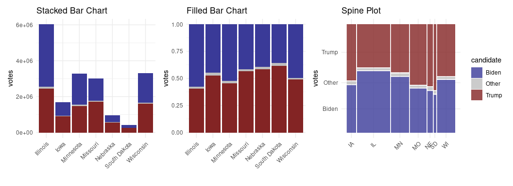
The stacked bar chart clearly shows the differing vote totals, but does not make it easy to compare vote proportions from one state to another. The filled version makes comparing proportions easy but does not show the differing vote totals. The spine chart also makes comparing proportions across states easy, and also reflects the differing vote totals in the widths of the bars. For the stated purpose the spine chart is the best choice.
2. Gapminder Tooltips
First create the plot object with a text aesthetic mapped to country:
library(dplyr)
library(ggplot2)
theme_set(theme_minimal() + theme(text = element_text(size = 16)))
library(gapminder)
gap <- filter(gapminder, year %% 10 == 7 & year >= 1977)
p <- ggplot(gap, aes(x = gdpPercap, y = lifeExp,
                     color = continent,
                     size = pop,
                     text = country)) +
    geom_point() +
    scale_size_area(max_size = 8) +
    scale_x_log10() +
    facet_wrap(~ year)
Then specify the text aesthetic as the tooltip in the ggplotly call. The style function from plotly can be used to adjust the background color.
library(plotly)
pp <- ggplotly(p, tooltip = "text")
style(pp, hoverlabel = list(bgcolor = "white"))
3. Cancellations and Destination Location
For the first three months of 2013, compute the number of flights, the average arrival delay, and the proportion of canceled flights to each of the destinations. Assume a flight is canceled it its departure time and arrival time are both missing.
It is useful to add a canceled variable to the flights table, assuming that canceled flights are those with both dep_time and arr_time missing:
library(dplyr)
library(nycflights13)
flights <- mutate(flights, canceled = is.na(dep_time) & is.na(arr_time))
For each destination and the first three months, compute the number of flights, percent canceled, and average arrival delay:
fl3 <- filter(flights, month <= 3) |>
    group_by(dest) |>
    summarize(n = n(),
              pcan = 100 * mean(canceled),
              delay = mean(arr_delay, na.rm = TRUE)) |>
    ungroup()
Focus on the top 50 destinations in terms of the number of flights from NYC during the first three months of 2013.
fl3_50 <- slice_max(fl3, n, n = 50)Create a map with a point at each of these destinations, and encode the proportion of canceled flights in the point’s size. Comment on what you see.
To show the data on a map, add location information by joining with data from the airports table:
fl3_50 <- left_join(fl3_50,
                    select(airports, faa, lat, lon, alt),
                    c("dest" = "faa"))
A map showing the cancellation percentages for the top 50 destinations:
library(ggplot2)
pm <- ggplot(fl3_50, aes(x = lon, y = lat)) +
    borders("state") +
    coord_map() +
    theme_void()
pm + geom_point(aes(size = pcan)) + scale_size_area()
## Warning: Removed 1 row containing missing values or values outside the scale range
## (`geom_point()`).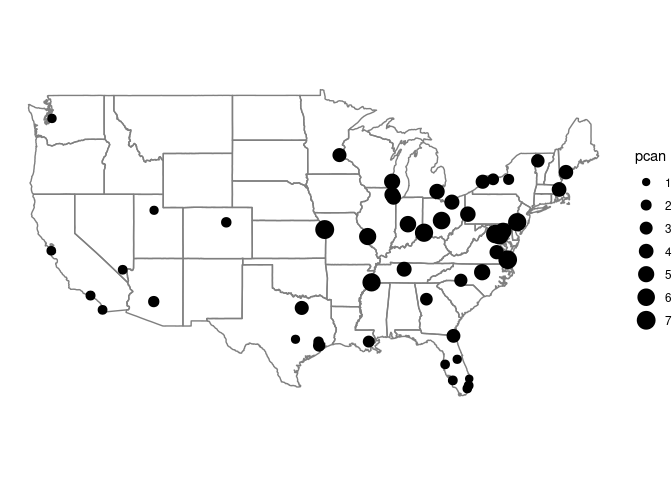
[The map only shows 49 airports since SJU (San Juan, Puerto Rico) is one of the top 50 but not in the airports date frame.]
Using alpha blending can help with the over-plotting along the east coast:
pm + geom_point(aes(size = pcan), alpha = 0.3) + scale_size_area()
## Warning: Removed 1 row containing missing values or values outside the scale range
## (`geom_point()`).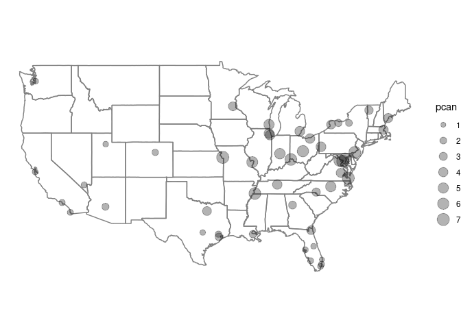
Cancellation percentages are higher for closer airports and airports likely to be experiencing similar weather conditions.
In addition to the location and proportion of canceled flights, whether the average arrival delay is more or less than 20 minutes could be encoded using color or shape. Try both approaches, comment on what you see and on the advantages and disadvantages of each approach.
Whether the average delay is 20 minutes or more can be encoded in using color or shape:
pm + geom_point(aes(size = pcan, color = delay >= 20)) + scale_size_area()
## Warning: Removed 1 row containing missing values or values outside the scale range
## (`geom_point()`).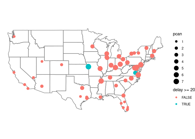
pm + geom_point(aes(size = pcan, shape = delay >= 20)) + scale_size_area()
## Warning: Removed 1 row containing missing values or values outside the scale range
## (`geom_point()`).
For a 15 minute cutoff there are a few more high delay destinations:
pm + geom_point(aes(size = pcan, color = delay >= 15)) + scale_size_area()
## Warning: Removed 1 row containing missing values or values outside the scale range
## (`geom_point()`).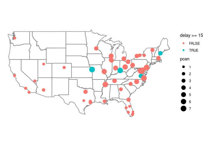
pm + geom_point(aes(size = pcan, shape = delay >= 15)) + scale_size_area()
## Warning: Removed 1 row containing missing values or values outside the scale range
## (`geom_point()`).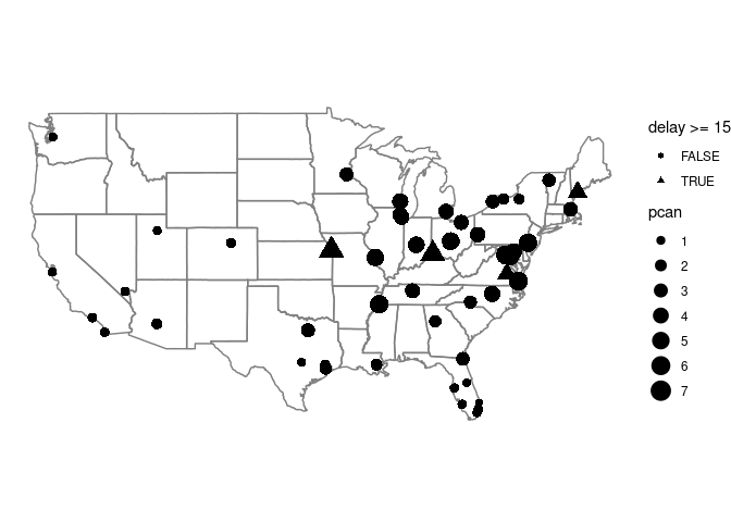
The size and shape channels interfere with each other quite a bit; color and size interfere with each other much less. Picking out the rarer shapes is also harder than spotting the different colors: color achieves better pop-out.
