class: center, middle, title-slide .title[ # Maps and Geographical Data ] .author[ ### Luke Tierney ] .institute[ ### University of Iowa ] .date[ ### 2025-04-29 ] --- <link rel="stylesheet" href="stat4580.css" type="text/css" /> <style type="text/css"> .remark-code { font-size: 85%; } </style> ## Data Types Many different kinds of data are shown on maps: -- * Points, location data. -- * Lines, routes, connections. -- * Area data, aggregates, rates. -- * Sampled surface data. -- * ... --- layout: true ## Map Types --- There are many different kinds of maps: -- * Dot maps -- * Symbol maps -- * Line maps -- * Choropleth maps -- * Cartograms and tiled maps -- * Linked micromaps -- * ... --- ### Dot Maps .pull-left[ * A dot map of violent crime locations in Houston. <!-- --> <img src="../img/houston-crime-dots.png" width="300" /> <!-- Data frame `crime` from `ggmap`. Original data from Houston PD. --> ] -- .pull-right[ <!-- * A [racial dot map](https://demographics.virginia.edu/DotMap/) of the US. --> * A [racial dot map](https://all-of-us.benschmidt.org/) of the US. {{content}} ] -- * Gun violence in America [article](https://www.theguardian.com/us-news/ng-interactive/2017/jan/09/special-report-fixing-gun-violence-in-america) in the Guardian. {{content}} -- * [Dot density maps](https://www.axismaps.com/guide/dot-density). {{content}} -- * [Bird migration patterns](https://web.archive.org/web/20200228110412/https://www.canadiangeographic.ca/article/mesmerizing-map-shows-bird-migrations-throughout-year). --- <!-- * [Comments on the Junk Charts blog]( https://junkcharts.typepad.com/junk_charts/2018/04/hog-wild-about-dot-maps.html) on dot maps. --> ### Symbol Maps .pull-left[ <!-- http://ashmalone.blogspot.com/2019/02/proportional-bivariate-choropleth.html --> * Increases and decreases in jobs. <img src="../img/Jobs.png" width="500" /> ] -- .pull-right[ * [How the US generated electricity](https://www.washingtonpost.com/graphics/national/power-plants/?utm_term=.506ef6f03d7c). {{content}} ] -- * [Graduated and proportional symbol maps](https://gisgeography.com/dot-distribution-graduated-symbols-proportional-symbol-maps/). <!-- img/gradsyms.jpeg --> --- ### Line Maps .pull-left[ * [Mapping connections with great circles](https://flowingdata.com/2011/05/11/how-to-map-connections-with-great-circles/).  ] -- .pull-right[ * [Airline route maps](https://www.airlineroutemaps.com/). {{content}} ] -- * [Wind maps](http://hint.fm/wind/). --- ### Isopleth, Isarithmic, or Contour Maps .pull-left[ * Density contours for Houston violent crime data: <!-- Image: https://github.com/dkahle/ggmap/raw/master/tools/README-styling-1.png --> <img src="../img/houston-crime-density.png" width="400" /> ] -- .pull-right[ * Bird flu deaths in California: <img src="https://i.ytimg.com/vi/UYmJCjPZP5A/maxresdefault.jpg" width="600" /> ] --- ### Choropleth Maps <img src="https://www.bls.gov/web/metro/twmcort.gif" width="500" /><img src="../img/mstrtcr1-08-2023.gif" width="500" /> --- * [Opinions on climate change](https://www.nytimes.com/interactive/2017/03/21/climate/how-americans-think-about-climate-change-in-six-maps.html?_r=0) -- * [Rise in health insurance coverage under the ACA](https://www.npr.org/sections/health-shots/2017/04/14/522956939/maps-show-a-dramatic-rise-health-in-insurance-coverage-under-aca) from NPR. --- ### Cartograms and Tiled Maps * An [introduction](http://blog.apps.npr.org/2015/05/11/hex-tile-maps.html) from the NPR blog. <img src="http://blog.apps.npr.org/img/posts/2015-05-11-hex-tile-maps/square-tiles.png" width="350" /><img src="http://blog.apps.npr.org/img/posts/2015-05-11-hex-tile-maps/hex-tiles.png" width="350" /><img src="http://blog.apps.npr.org/img/posts/2015-05-11-hex-tile-maps/cartogram.jpg" width="350" /> -- * One approach to [cartograms in R](http://staff.math.su.se/hoehle/blog/2016/10/10/cartograms.html). --- ### Linked Micromaps .pull-left[ * Poverty and education. <!-- https://www.researchgate.net/figure/A-linked-micromap-redisplay-of-poverty-and-college-education-data-from-Fig-1-with-maps_fig2_228101144 --> <img src="../img/linked-micromap-poverty-education.png" width="650" /> ] .pull-right[ <!-- * A [D3 approach](http://bl.ocks.org/jazzido/raw/5962277/). --> ] --- layout: true ## Drawing Maps --- At the simplest level drawing a map involves: -- * possibly loading a background image, such as terrain; -- * drawing or filling polygons that represent region boundaries; -- * adding points, lines, and other annotations. --- But there are a number of complications: -- * you need to obtain the polygons representing the regions; -- * regions with several pieces; -- * holes in regions; lakes in islands in lakes; -- * projections for mapping spherical longitude/lattitude coordinates to a plane; -- * aspect ratio; -- * making sure map and annotation layers are consistent in their use of coordinates and aspect ratio; -- * connecting your data to the geographic features. -- High level tools are available for creating some standard map types. -- These tools usually have some limitations. -- Creating maps directly, building on the things you have learned so far, gives more flexibility. --- layout: true ## Basic Map Data --- Basic map data consisting of latitude and longitude of points along borders is available in the `maps` package. -- The `ggplot2` function `map_data` accesses this data and reorganizes it into a data frame. ``` r library(ggplot2) gusa <- map_data("state") head(gusa, 4) ## long lat group order region subregion ## 1 -87.46201 30.38968 1 1 alabama <NA> ## 2 -87.48493 30.37249 1 2 alabama <NA> ## 3 -87.52503 30.37249 1 3 alabama <NA> ## 4 -87.53076 30.33239 1 4 alabama <NA> ``` -- The `borders` function in `ggplot2` uses this data to create a simple outline map. --- .pull-left.tiny-code[ Borders data for Johnson and Linn Counties: ``` r jl_bdr <- map_data("county", "iowa") |> filter(subregion %in% c("johnson", "linn")) jl_bdr ## long lat group order region subregion ## 1 -91.34666 41.60819 52 531 iowa johnson ## 2 -91.35239 41.42485 52 532 iowa johnson ## 3 -91.47272 41.43058 52 533 iowa johnson ## 4 -91.48417 41.44777 52 534 iowa johnson ## 5 -91.48990 41.46495 52 535 iowa johnson ## 6 -91.50136 41.47642 52 536 iowa johnson ## 7 -91.49563 41.49934 52 537 iowa johnson ## 8 -91.50136 41.51079 52 538 iowa johnson ## 9 -91.51855 41.52225 52 539 iowa johnson ## 10 -91.82221 41.51652 52 540 iowa johnson ## 11 -91.81648 41.60819 52 541 iowa johnson ## 12 -91.82794 41.60819 52 542 iowa johnson ## 13 -91.82221 41.87175 52 543 iowa johnson ## 14 -91.35239 41.87175 52 544 iowa johnson ## 15 -91.34666 41.60819 52 545 iowa johnson ## 16 -91.82221 42.30148 57 609 iowa linn ## 17 -91.58730 42.30148 57 610 iowa linn ## 18 -91.35239 42.30148 57 611 iowa linn ## 19 -91.35239 41.95197 57 612 iowa linn ## 20 -91.35239 41.87175 57 613 iowa linn ## 21 -91.82221 41.87175 57 614 iowa linn ## 22 -91.82221 42.30148 57 615 iowa linn ``` ] --- .pull-left[ Vertex locations: ``` r ggplot(jl_bdr, aes(x = long, y = lat)) + geom_point() + coord_map() ``` ] .pull-right[ <!-- --> ] --- .pull-left[ Add polygons: ``` r ggplot(jl_bdr, aes(x = long, y = lat, * group = subregion)) + geom_point() + * geom_polygon(color = "black", fill = NA) + coord_map() ``` ] .pull-right[ <!-- --> ] --- .pull-left[ Fill polygons: ``` r ggplot(jl_bdr, aes(x = long, y = lat, * fill = subregion)) + geom_point() + geom_polygon(color = "black") + guides(fill = "none") + coord_map() ``` ] .pull-right[ <!-- --> ] --- Simple polygon data along with `geom_polygon()` works reasonably well for many simple applications. -- For more complex applications it is best to use special spatial data structures. -- An approach becoming widely adopted in many open-source frameworks for working with spatial data is called [simple features](../maps2.html#simple-features). --- There are 63 regions in the state boundaries data because several states consist of disjoint regions. -- A selection: ``` r filter(gusa, region %in% c("massachusetts", "michigan", "virginia")) |> select(region, subregion) |> unique() ## region subregion ## 1 massachusetts martha's vineyard ## 37 massachusetts main ## 257 massachusetts nantucket ## 287 michigan north ## 747 michigan south ## 1117 virginia chesapeake ## 1213 virginia chincoteague ## 1228 virginia main ``` --- The map can be drawn using `geom_polygon`: .pull-left[ <!-- --> ] -- .pull-right[ ``` r p_usa <- ggplot(gusa) + geom_polygon(aes(x = long, y = lat, group = group), fill = NA, color = "darkgrey") p_usa ``` {{content}} ] -- This map looks odd since it is not using a sensible _projection_ for converting the spherical longitude/latitude coordinates to a flat surface. --- layout: true ## Projections --- Longitude/latitude position points on a sphere; maps are drawn on a flat surface. -- One degree of latitude corresponds to about 69 miles everywhere. -- But one degree of longitude is shorter farther away from the equator. -- In Iowa City, at latitude 41.6 degrees north, one degree of longitude corresponds to about $$ 69 \times \cos(41.6 / 90 \times \pi / 2) \approx 52 $$ miles. -- A commonly used projection is the [_Mercator projection_](https://en.wikipedia.org/wiki/Mercator_projection). -- The Mercator projection is a cylindrical projection that preserves angles but distorts areas far away from the equator. --- An illustration of the area distortion in the Mercator projection: <!-- https://tenor.com/view/mercator-vs-true-world-map-true-coutry-size-original-world-map-world-map-real-world-shrink-gif-17118549 --> <img src="../img/mercator-true-size.gif" width="650" /> --- The Mercator projection is the default projection used by `coord_map`: .pull-left[ ``` r p_usa + coord_map() ``` <!-- --> ] -- .pull-right[ Other projections can be specified instead. ] --- One alternative is The [_Bonne projection_](https://en.wikipedia.org/wiki/Bonne_projection). .pull-left[ ``` r p_usa + * coord_map("bonne", parameters = 41.6) ``` <!-- --> ] -- .pull-right[ The Bonne projection is an equal area projection that preserves shapes around a standard latitude but distorts farther away. {{content}} ] -- This preserves shapes at the latitude of Iowa City. {{content}} -- The projections applied with `coord_map` will be used in all layers. --- layout: true ## Wind Turbines in Iowa --- Data on wind turbines is available [here](https://eerscmap.usgs.gov/uswtdb/data/). -- A snapshot of the data is available [locally](https://stat.uiowa.edu/~luke/data/uswtdb_v7_2_20241120.csv.gz). -- The locations for Iowa can be shown on a map of Iowa county borders. -- .pull-left.width-60[ First, get the wind turbine data: .smaller-code[ ``` r wtfile <- "uswtdb_v7_2_20241120.csv.gz" if (! file.exists(wtfile)) download.file(paste0("https://stat.uiowa.edu/~luke/data/", wtfile), wtfile) wind_turbines <- read.csv(wtfile) wt_IA <- filter(wind_turbines, t_state == "IA") |> mutate(p_year = replace(p_year, p_year < 0, NA)) ``` ] ] --- .pull-left[ Next, get the map data: ``` r giowa <- map_data("county", "iowa") ``` {{content}} ] -- A map of iowa county borders: ``` r p <- ggplot(giowa) + geom_polygon( aes(x = long, y = lat, group = group), fill = NA, color = "grey") + coord_map() p ``` -- .pull-right[ <!-- --> ] --- .pull-left[ Add the wind turbine locations: ``` r p + geom_point(aes(x = xlong, y = ylat), data = wt_IA) ``` ] .pull-right[ <!-- --> ] --- .pull-left[ Use color to show the year of construction: ``` r p + geom_point(aes(x = xlong, y = ylat, color = p_year), data = wt_IA) + scale_color_viridis_c() ``` ] .pull-right[ <!-- --> ] --- .pull-left[ A background map showing features like terrain or city locations and major roads can often help. {{content}} ] -- Maps are available from various sources, with various restrictions and limitations. {{content}} -- [Stamen maps](https://stamen.com/open-source/) are often a good option. Stamen maps are now hosted by Stadia Maps. {{content}} -- The `ggmap` package provides an interface for using Stamen maps. {{content}} -- A Stamen _toner_ map background: ``` r library(ggmap) register_stadiamaps(StadiaKey, write = FALSE) m <- get_stadiamap( c(-97.2, 40.4, -89.9, 43.6), zoom = 8, maptype = "stamen_toner") ggmap(m) ``` -- .pull-right[ <!-- --> ] --- .pull-left[ County borders with a [Stamen map](https://stamen.com/open-source/) background: ``` r ggmap(m) + geom_polygon(aes(x = long, y = lat, group = group), data = giowa, fill = NA, color = "grey") ``` ] .pull-right[ <!-- --> ] --- .pull-left[ Add the wind turbine locations: ``` r ggmap(m) + geom_polygon(aes(x = long, y = lat, group = group), data = giowa, fill = NA, color = "grey") + geom_point(aes(x = xlong, y = ylat, color = p_year), data = wt_IA) + scale_color_viridis_c() ``` ] .pull-right[ <!-- --> {{content}} ] -- With other backgrounds it might be necessary to choose a different color palette. --- layout: true ## County Population Data --- <!-- Old csv data may be here: https://www.census.gov/programs-surveys/popest.html https://www.census.gov/programs-surveys/popest/data/tables.html They seem to want you to use API for new stuff. A couple of R packages do that. The 2020-2021 data seems to be here: https://www2.census.gov/programs-surveys/popest/datasets/2020-2021/counties/totals/co-est2021-alldata.csv The 2020-2024 numbers seem to be here (for now ...): https://www2.census.gov/programs-surveys/popest/datasets/2020-2024/counties/totals/co-est2024-alldata.csv But using numbers after 2021 is complicated because of Connecticut: https://www.federalregister.gov/documents/2022/06/06/2022-12063/change-to-county-equivalents-in-the-state-of-connecticut --> The census bureau provides [estimates](https://data.census.gov/) of populations of US counties. -- * Estimates are available in several formats, including CSV. -- * The CSV file for 2020-2021 is available at <https://stat.uiowa.edu/~luke/data/co-est2021-alldata.csv>. -- * The zip-compressed CSV file for 2010-2019 is available at <https://stat.uiowa.edu/~luke/data/co-est2019-alldata.zip>. -- State and county level population counts can be visualized several ways, e.g.: -- * proportional symbol maps; -- * choropleth maps (a common choice, but not a good one!). -- For a proportional symbol map we need to pick locations for the symbols. --- First step: read the data. .hide-code[ <!-- ## nolint start: object_usage --> ``` r readPEP <- function(fname) { read.csv(fname, encoding = "latin1") |> filter(COUNTY != 0) |> ## drop state totals mutate(FIPS = 1000 * STATE + COUNTY) |> select(FIPS, county = CTYNAME, state = STNAME, starts_with("POPESTIMATE")) |> pivot_longer(starts_with("POPESTIMATE"), names_to = "year", names_prefix = "POPESTIMATE", values_to = "pop") } if (! file.exists("co-est2021-alldata.csv")) download.file("https://stat.uiowa.edu/~luke/data/co-est2021-alldata.csv", "co-est2021-alldata.csv") pep2021 <- readPEP("co-est2021-alldata.csv") ``` <!-- ## nolint end --> ] For the 2021 data: .smaller-code[ ``` r head(pep2021) ## # A tibble: 6 × 5 ## FIPS county state year pop ## <dbl> <chr> <chr> <chr> <int> ## 1 1001 Autauga County Alabama 2020 58877 ## 2 1001 Autauga County Alabama 2021 59095 ## 3 1003 Baldwin County Alabama 2020 233140 ## 4 1003 Baldwin County Alabama 2021 239294 ## 5 1005 Barbour County Alabama 2020 25180 ## 6 1005 Barbour County Alabama 2021 24964 ``` ] -- Counties and states are identified by name and also by [FIPS code](https://en.wikipedia.org/wiki/FIPS_county_code). -- The final three digits identify the county within a state. -- The leading one or two digits identify the state. -- The FIPS code for Johnson County, IA is 19103. --- layout: false ## Create a Proportional Symbol Map of State Populations We will need: -- * State population counts. -- * Locations for symbols to represent these counts. -- Aggregate the county populations to the state level: -- ``` r state_pops <- mutate(pep2021, state = tolower(state)) |> filter(year == 2021) |> group_by(state) |> summarize(pop = sum(pop, na.rm = TRUE)) |> ungroup() ``` -- Using `tolower` matches the case in the polygon data: ``` r filter(gusa, region == "iowa") |> head(1) ## long lat group order region subregion ## 1 -91.22634 43.49895 14 3539 iowa <NA> ``` -- An alternative would be to use the state FIPS code and the `state.fips` table. --- layout: true ## Computing Centroids --- Marks representing data values for a region are often placed at the region's _centroid_, or centers of gravity. -- A quick approximation to the centroids of the polygons is to compute the centers of their bounding rectangles. .pull-left[ ``` r state_centroids_quick <- rename(gusa, state = region) |> group_by(state) |> summarize(x = mean(range(long)), y = mean(range(lat))) p_usa + geom_point(aes(x, y), data = state_centroids_quick, color = "blue") + coord_map() ``` ] -- .pull-right[ <!-- --> ] --- More sophisticated approaches to computing centroids are also available. Using [_simple features_](#simple-features) and the `sf` package: .pull-left.smaller-code[ ``` r sf::sf_use_s2(FALSE) state_centroids <- sf::st_as_sf(gusa, coords = c("long", "lat"), crs = 4326) |> group_by(region) |> summarize(do_union = FALSE) |> sf::st_cast("POLYGON") |> ungroup() |> sf::st_centroid() |> sf::as_Spatial() |> as.data.frame() |> rename(x = coords.x1, y = coords.x2, state = region) sf::sf_use_s2(TRUE) pp <- p_usa + geom_point(aes(x, y), data = state_centroids, color = "red") pp + coord_map() ``` ] .pull-right[ <!-- --> ] --- Comparing the two approaches: .pull-left[ ``` r p_usa + geom_point(aes(x, y), data = state_centroids_quick, color = "blue") + geom_point(aes(x, y), data = state_centroids, color = "red") + coord_map() ``` ] .pull-right[ <!-- --> ] --- A projection specified with `coord_map` will be applied to all layers: .pull-left[ ``` r p_usa + geom_point(aes(x, y), data = state_centroids_quick, color = "blue") + geom_point(aes(x, y), data = state_centroids, color = "red") + coord_map("bonne", parameters = 41.6) ``` ] .pull-right[ <!-- --> ] --- Centroids are not guaranteed to be inside a polygon. A _point on surface_ is computed in a way that is guaranteed to be inside. .pull-left.tiny-code[ ``` r sf::sf_use_s2(FALSE) state_point_on_surface <- sf::st_as_sf(gusa, coords = c("long", "lat"), crs = 4326) |> group_by(region) |> summarize(do_union = FALSE) |> sf::st_cast("POLYGON") |> ungroup() |> * sf::st_point_on_surface() |> sf::as_Spatial() |> as.data.frame() |> rename(x = coords.x1, y = coords.x2, state = region) sf::sf_use_s2(TRUE) p_usa + geom_point(aes(x, y), data = state_centroids_quick, color = "blue") + geom_point(aes(x, y), data = state_centroids, color = "red") + geom_point(aes(x, y), data = state_centroids, color = "red") + geom_point(aes(x, y), data = state_point_on_surface, color = "forestgreen") + coord_map("bonne", parameters = 41.6) ``` ] .pull-right[ <!-- --> ] --- layout: true ## Symbol Plots of State Population --- Merge in the centroid locations. -- ``` r state_pops <- inner_join(state_pops, state_centroids, "state") head(state_pops) ## # A tibble: 6 × 4 ## state pop x y ## <chr> <int> <dbl> <dbl> ## 1 alabama 5039877 -86.8 32.8 ## 2 arizona 7276316 -112. 34.3 ## 3 arkansas 3025891 -92.4 34.9 ## 4 california 39237836 -120. 37.3 ## 5 colorado 5812069 -106. 39.0 ## 6 connecticut 3605597 -72.7 41.6 ``` -- Using `inner_join` drops cases not included in the lower-48 map data. --- A dot plot: .pull-left[ <!-- --> ] .pull-right.smaller-code[ ``` r ggplot(state_pops) + geom_point(aes(x = pop, y = reorder(state, pop))) + labs(x = "Population", y = "") + theme(axis.text.y = element_text(size = 10)) + scale_x_continuous(labels = scales::comma) ``` {{content}} ] -- The population distribution is heavily skewed; a color coding would need to account for this. --- A proportional symbol map: .pull-left[ ``` r p_usa + geom_point(aes(x, y, size = pop), data = state_pops) + scale_size_area() + coord_map("bonne", parameters = 41.6) + ggthemes::theme_map() ``` ] -- .pull-right[ <!-- --> ] --- With a fancier legend: .pull-left[ ``` r p_usa + geom_point(aes(x, y, size = pop), data = state_pops) + scale_size_area( labels = scales::label_comma(), breaks = c(5000000, 15000000, 30000000), max_size = 10, guide = legendry::guide_circles() ) + labs(size = "Population") + coord_map("bonne", parameters = 41.6) + ggthemes::theme_map() + theme( legend.text = element_text(size = rel(0.55)), legend.ticks = element_line(colour = "black", linetype = "22")) ``` ] .pull-right[ <!-- --> ] --- .pull-left.smaller-code[ The thermometer symbol approach suggested by Cleveland and McGill (1984) can be emulated using `geom_rect`: ``` r p_usa + geom_rect(aes(xmin = x - .4, xmax = x + .4, ymin = y - 1, ymax = y + 2 * (pop / max(pop)) - 1), data = state_pops) + geom_rect(aes(xmin = x - .4, xmax = x + .4, ymin = y - 1, ymax = y + 1), data = state_pops, fill = NA, color = "black") + coord_map() + ggthemes::theme_map() ``` ] -- .pull-right[ <!-- --> {{content}} ] -- To work well along the northeast this would need a strategy similar to the one used by `ggrepel` for preventing label overlap. --- layout: true ## Choropleth Maps of State Population --- A choropleth map needs to have the information for coloring all the pieces of a region. -- This can be done by merging using `left_join`: ``` r sp <- select(state_pops, region = state, pop) gusa_pop <- left_join(gusa, sp, "region") head(gusa_pop) ## long lat group order region subregion pop ## 1 -87.46201 30.38968 1 1 alabama <NA> 5039877 ## 2 -87.48493 30.37249 1 2 alabama <NA> 5039877 ## 3 -87.52503 30.37249 1 3 alabama <NA> 5039877 ## 4 -87.53076 30.33239 1 4 alabama <NA> 5039877 ## 5 -87.57087 30.32665 1 5 alabama <NA> 5039877 ## 6 -87.58806 30.32665 1 6 alabama <NA> 5039877 ``` --- A first attempt: .pull-left[ ``` r ggplot(gusa_pop) + geom_polygon(aes(long, lat, group = group, fill = pop)) + coord_map("bonne", parameters = 41.6) + ggthemes::theme_map() ``` ] .pull-right[ 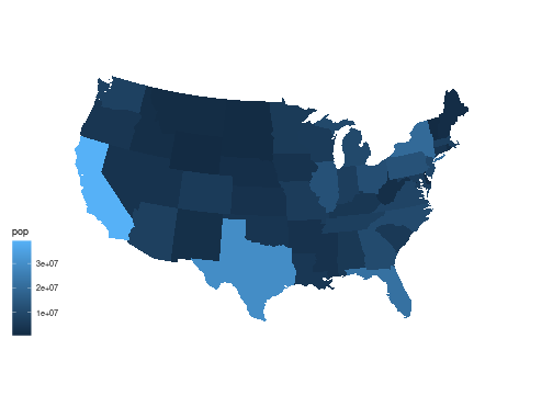<!-- --> {{content}} ] -- This image is dominated by the fact that most state populations are small. --- Showing population ranks, or percentile values, can help see the variation a bit better. -- .pull-left[ ``` r spr <- mutate(sp, rpop = rank(pop)) ``` {{content}} ] -- ``` r gusa_rpop <- left_join(gusa, spr, "region") ``` {{content}} -- ``` r ggplot(gusa_rpop) + geom_polygon(aes(long, lat, group = group, fill = rpop)) + coord_map("bonne", parameters = 41.6) + ggthemes::theme_map() ``` -- .pull-right[ 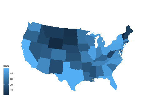<!-- --> ] --- Using quintile bins instead of a continuous scale: -- .pull-left.smaller-code[ ``` r spr <- mutate(spr, pcls = cut_width(100 * percent_rank(pop), width = 20, center = 10)) ``` {{content}} ] -- ``` r gusa_rpop <- left_join(gusa, spr, "region") ``` {{content}} -- ``` r ggplot(gusa_rpop) + geom_polygon(aes(long, lat, group = group, fill = pcls), color = "grey") + coord_map("bonne", parameters = 41.6) + ggthemes::theme_map() + scale_fill_brewer(palette = "Reds", name = "Percentile") ``` -- .pull-right[ 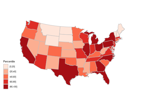<!-- --> ] --- layout: true ## Choropleth Maps of County Population --- For a county-level `ggplot` map, first get the polygon data frame: -- .pull-left[ ``` r gcounty <- map_data("county") ``` {{content}} ] -- ``` r ggplot(gcounty) + geom_polygon(aes(long, lat, group = group), fill = NA, color = "black", linewidth = 0.05) + coord_map("bonne", parameters = 41.6) ``` -- .pull-right[ <!-- --> ] --- We will again need to merge population data with the polygon data. -- Using county name is challenging because of mismatches like this: -- ``` r filter(gcounty, grepl("brien", subregion)) |> head(1) ## long lat group order region subregion ## 1 -95.86156 43.26404 825 26075 iowa obrien filter(pep2021, FIPS == 19141, year == 2021) |> as.data.frame() ## FIPS county state year pop ## 1 19141 O'Brien County Iowa 2021 14015 ``` -- Another example: ``` r filter(pep2021, state == "New Mexico") |> _$county[15:16] ## [1] "Doña Ana County" "Doña Ana County" filter(gcounty, region == "new mexico") |> _$subregion |> unique() |> _[7] ## [1] "dona ana" ``` --- A better option is to match on [FIPS](https://en.wikipedia.org/wiki/FIPS_county_code) county code. -- The `county.fips` data frame in the `maps` package links the FIPS code to region names used by the map data in the `maps` package. ``` r head(maps::county.fips, 4) ## fips polyname ## 1 1001 alabama,autauga ## 2 1003 alabama,baldwin ## 3 1005 alabama,barbour ## 4 1007 alabama,bibb ``` --- To attach the FIPS code to the polygons we first need to clean up the `county.fips` table a bit: ``` r filter(maps::county.fips, grepl(":", polyname)) |> head(3) ## fips polyname ## 1 12091 florida,okaloosa:main ## 2 12091 florida,okaloosa:spit ## 3 22099 louisiana,st martin:north ``` -- Remove the sub-county regions, remove duplicate rows, and split the `polyname` variable into `region` and `subregion`. ``` r fipstab <- transmute(maps::county.fips, fips, county = sub(":.*", "", polyname)) |> unique() |> separate(county, c("region", "subregion"), sep = ",") head(fipstab, 3) ## fips region subregion ## 1 1001 alabama autauga ## 2 1003 alabama baldwin ## 3 1005 alabama barbour ``` --- Then use `left_join` to merge the FIPS code into the polygon data: ``` r gcounty <- left_join(gcounty, fipstab, c("region", "subregion")) head(gcounty) ## long lat group order region subregion fips ## 1 -86.50517 32.34920 1 1 alabama autauga 1001 ## 2 -86.53382 32.35493 1 2 alabama autauga 1001 ## 3 -86.54527 32.36639 1 3 alabama autauga 1001 ## 4 -86.55673 32.37785 1 4 alabama autauga 1001 ## 5 -86.57966 32.38357 1 5 alabama autauga 1001 ## 6 -86.59111 32.37785 1 6 alabama autauga 1001 ``` --- Next, we need to pull together the data for the map, adding ranks and quintile bins. ``` r cpop <- filter(pep2021, year == 2021) |> select(fips = FIPS, pop) |> mutate(rpop = rank(pop), pcls = cut_width(100 * percent_rank(pop), width = 20, center = 10)) head(cpop) ## # A tibble: 6 × 4 ## fips pop rpop pcls ## <dbl> <int> <dbl> <fct> ## 1 1001 59095 2256 (60,80] ## 2 1003 239294 2855 (80,100] ## 3 1005 24964 1529 (40,60] ## 4 1007 22477 1446 (40,60] ## 5 1009 59041 2255 (60,80] ## 6 1011 10320 755 (20,40] ``` -- Now left join with the county map data: ``` r gcounty_pop <- left_join(gcounty, cpop, "fips") ``` --- County level population map using the default continuous color scale: -- .pull-left[ ``` r ggplot(gcounty_pop) + geom_polygon(aes(long, lat, group = group, fill = rpop), color = "grey", linewidth = 0.1) + coord_map("bonne", parameters = 41.6) + ggthemes::theme_map() ``` ] -- .pull-right[ <!-- --> ] --- Adding state boundaries might help: .pull-left[ ``` r ggplot(gcounty_pop) + geom_polygon(aes(long, lat, group = group, fill = rpop), color = "grey", linewidth = 0.1) + * geom_polygon(aes(long, lat, * group = group), * fill = NA, * data = gusa, * color = "lightgrey") + coord_map("bonne", parameters = 41.6) + ggthemes::theme_map() ``` ] .pull-right[ <!-- --> ] --- A discrete scale with a very different color to highlight the counties with missing information: .pull-left[ ``` r ggplot(gcounty_pop) + geom_polygon(aes(long, lat, group = group, * fill = pcls), color = "grey", linewidth = 0.1) + geom_polygon(aes(long, lat, group = group), fill = NA, data = gusa, color = "lightgrey") + coord_map("bonne", parameters = 41.6) + ggthemes::theme_map() + * scale_fill_brewer(palette = "Reds", * na.value = "blue", * name = "Percentile") ``` ] .pull-right[ <!-- --> ] --- Why is there a missing value in South Dakota? -- Check whether `fipstab` provides a FIPS code for every county in the map data: ``` r gcounty_regions <- select(gcounty, region, subregion) |> unique() anti_join(gcounty_regions, fipstab, c("region", "subregion")) ## region subregion ## 1 south dakota oglala lakota ``` -- There is also a `fipstab` entry without map data: ``` r anti_join(fipstab, gcounty_regions, c("region", "subregion")) ## fips region subregion ## 1 46113 south dakota shannon ``` -- Shannon County SD was renamed [Oglala Lakota County](https://en.wikipedia.org/wiki/Oglala_Lakota_County,_South_Dakota) in 2015. -- It was also given a [new FIPS code](https://www.census.gov/programs-surveys/geography/technical-documentation/county-changes.html). <!-- The map data tries to reflect this but gets the spelling wrong. this is fixed now; county.fips is not fixed yet --> --- The `pep2021` entry shows the correct FIPS code: ``` r filter(pep2021, year == 2021, state == "South Dakota", grepl("Oglala", county)) ## # A tibble: 1 × 5 ## FIPS county state year pop ## <dbl> <chr> <chr> <chr> <int> ## 1 46102 Oglala Lakota County South Dakota 2021 13586 ``` -- Add an entry with the FIPS code and subregion name matching the map data: ``` r fipstab <- rbind(fipstab, data.frame(fips = 46102, region = "south dakota", subregion = "oglala lakota")) ``` --- .pull-left[ Fix up the data: ``` r gcounty <- map_data("county") gcounty <- left_join(gcounty, fipstab, c("region", "subregion")) gcounty_pop <- left_join(gcounty, cpop, "fips") ``` ] -- .pull-right[ Redraw the plot: <!-- --> ] --- layout: true ## A County Population Symbol Map --- A symbol map can also be used to show the county populations. -- We again need centroids; approximate county centroids should do. -- ``` r county_centroids <- group_by(gcounty, fips) |> summarize(x = mean(range(long)), y = mean(range(lat))) ``` -- Merge the population values into the centroids data: -- ``` r county_pops <- select(cpop, pop, fips) county_pops <- inner_join(county_pops, county_centroids, "fips") ``` --- A proportional symbol map of county populations: -- .pull-left[ ``` r ggplot(gcounty) + geom_polygon(aes(long, lat, group = group), fill = NA, col = "grey", data = gusa) + geom_point(aes(x, y, size = pop), data = county_pops) + scale_size_area() + coord_map("bonne", parameters = 41.6) + ggthemes::theme_map() ``` ] -- .pull-right[ <!-- --> Jittering might be helpful to remove the very regular grid patters in the center. ] --- layout: true ## Comparing Populations in 2010 and 2021 --- One possible way to compare spatial data for several time periods is to use a faceted display with one map for each period. -- With many periods using animation is also an option. -- This can work well when there is a substantial amount of change; an example used to be available <!-- https://projects.fivethirtyeight.com/mortality-rates-united-states/cardiovascular2/#1980 --> [here](https://web.archive.org/web/20240410051508/https://projects.fivethirtyeight.com/mortality-rates-united-states/cardiovascular2/#1980). <!-- alternative: https://observablehq.com/@slopp/timeseries-us-county-choropleth-template https://rahosbach.github.io/2018-10-27-d3UnemploymentChoropleth/ https://ghdx.healthdata.org/record/ihme-data/united-states-mortality-rates-county-1980-2014 https://www.cdc.gov/nchs/pressroom/sosmap/heart_disease_mortality/heart_disease.htm --> --- A similar example using some state-level data from the [CDC](https://www.cdc.gov/nchs/pressroom/stats_of_the_states.htm): <!-- --> -- A faceted display may not work as well when the changes are more subtle. --- To bin the county population data by quintiles we can use the 2021 values. ``` r ncls <- 6 cls <- quantile(filter(pep2021, year == 2021)$pop, seq(0, 1, len = ncls)) ``` -- To merge the binned population data into the polygon data we can create a data frame with binned population variables for the two time frames. -- This will allow a cleaner merge in terms of handling counties with missing data. --- After selecting the years and the variables we need, we add the binned population and then pivot to a wider form with one row per county: ``` r cpop <- bind_rows(filter(pep2019, year == 2010), filter(pep2021, year == 2021)) |> transmute(fips = FIPS, year, pcls = cut(pop, cls, include.lowest = TRUE)) |> pivot_wider(values_from = c("pcls"), names_from = "year", names_prefix = "pcls") head(cpop) ## # A tibble: 6 × 3 ## fips pcls2010 pcls2021 ## <dbl> <fct> <fct> ## 1 1001 (3.68e+04,9.71e+04] (3.68e+04,9.71e+04] ## 2 1003 (9.71e+04,9.83e+06] (9.71e+04,9.83e+06] ## 3 1005 (1.87e+04,3.68e+04] (1.87e+04,3.68e+04] ## 4 1007 (1.87e+04,3.68e+04] (1.87e+04,3.68e+04] ## 5 1009 (3.68e+04,9.71e+04] (3.68e+04,9.71e+04] ## 6 1011 (8.7e+03,1.87e+04] (8.7e+03,1.87e+04] ``` --- This data can now be merged with the polygon data. ``` r gcounty_pop <- left_join(gcounty, cpop, "fips") ``` -- To create a faceted display with `ggplot` we need the data in _tidy_ form. -- ``` r gcounty_pop_long <- pivot_longer(gcounty_pop, starts_with("pcls"), names_to = "year", names_prefix = "pcls", values_to = "pcls") |> mutate(year = as.integer(year)) ``` -- An alternative would be to create two layers and show them in separate facets. --- .hide-code[ ``` r ggplot(gcounty_pop_long) + geom_polygon(aes(long, lat, group = group, fill = pcls), color = "grey", linewidth = 0.1) + geom_polygon(aes(long, lat, group = group), fill = NA, data = gusa, color = "lightgrey") + coord_map("bonne", parameters = 41.6) + ggthemes::theme_map() + scale_fill_brewer(palette = "Reds", na.value = "blue") + facet_wrap(~ year, ncol = 2) + theme(legend.position = "right") ``` <!-- --> ] -- Since the changes are quite subtle a side-by-side display does not work very well. --- A more effective approach in this case is to plot the relative changes. -- This is also a (somewhat) more appropriate use of a choropleth map. -- Start by adding percent changes to the data. ``` r cpop <- bind_rows(filter(pep2019, year == 2010), filter(pep2021, year == 2021)) |> select(fips = FIPS, pop, year) |> pivot_wider(values_from = "pop", names_from = "year", names_prefix = "pop") |> mutate(pchange = 100 * (pop2021 - pop2010) / pop2010) gcounty_pop <- left_join(gcounty, cpop, "fips") ``` -- A binned version of the percent changes will also be useful. ``` r bins <- c(-Inf, -20, -10, -5, 5, 10, 20, Inf) cpop <- mutate(cpop, cpchange = cut(pchange, bins, ordered_result = TRUE)) gcounty_pop <- left_join(gcounty, cpop, "fips") ``` --- Using a continuous scale with the default palette: .hide-code[ ``` r pcounty <- ggplot(gcounty_pop) + coord_map("bonne", parameters = 41.6) + ggthemes::theme_map() state_layer <- geom_polygon(aes(long, lat, group = group), fill = NA, data = gusa, color = "lightgrey") county_cont <- geom_polygon(aes(long, lat, group = group, fill = pchange), color = "grey", linewidth = 0.1) pcounty + county_cont + state_layer + theme(legend.position = "right") ``` 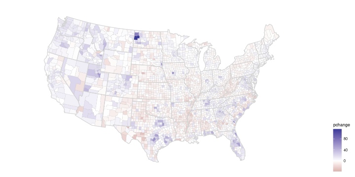<!-- --> ] --- Using a simple diverging palette: .hide-code[ ``` r pcounty + county_cont + state_layer + scale_fill_gradient2() + theme(legend.position = "right") ``` 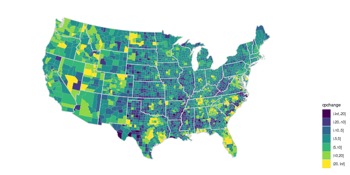<!-- --> ] --- For the binned version the default ordered discrete color palette produces: .hide-code[ ``` r county_disc <- geom_polygon(aes(long, lat, group = group, fill = cpchange), color = "grey", linewidth = 0.1) pcounty + county_disc + state_layer + theme(legend.position = "right") ``` 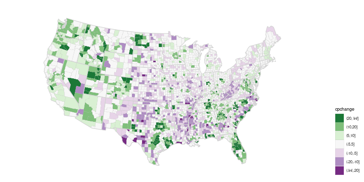<!-- --> ] --- A diverging palette allows increases and decreases to be seen. -- Using the `PRGn` palette from `ColorBrewer`: .hide-code[ ``` r (p_dvrg_48 <- pcounty + county_disc + state_layer + scale_fill_brewer(palette = "PRGn", na.value = "red", guide = guide_legend(reverse = TRUE))) + theme(legend.position = "right") ``` 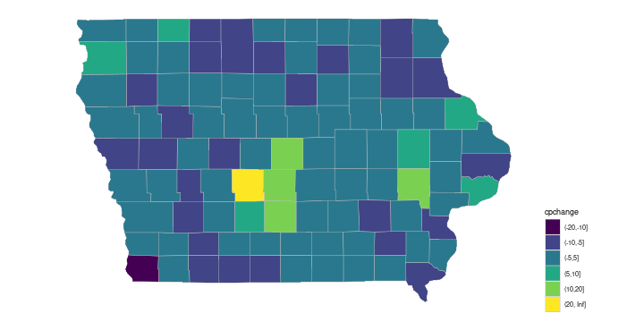<!-- --> ] --- layout: true ## Focusing on Iowa --- The default continuous palette produces .hide-code[ ``` r piowa <- ggplot(filter(gcounty_pop, region == "iowa")) + coord_map() + ggthemes::theme_map() pc_cont_iowa <- geom_polygon(aes(long, lat, group = group, fill = pchange), color = "grey", linewidth = 0.2) piowa + pc_cont_iowa + theme(legend.position = "right") ``` ] .pull-left[ <!-- --> ] -- .pull-right[ Aside: Iowa has 99 counties, which seems a peculiar number. {{content}} ] -- It used to have 100: {{content}} -- * [Kossuth county](https://en.wikipedia.org/wiki/Kossuth_County,_Iowa) {{content}} -- * [Bancroft county](https://en.wikipedia.org/wiki/Bancroft_County,_Iowa) --- With the default ordered discrete palette: .hide-code[ ``` r ## show.legend = TRUE is needed to make drop = FALSE work later pc_disc_iowa <- geom_polygon(aes(long, lat, group = group, fill = cpchange), color = "grey", linewidth = 0.2, show.legend = TRUE) piowa + pc_disc_iowa + theme(legend.position = "right") ``` <!-- --> ] --- Using the `PRGn` palette, for example, will by default adjust the palette to the levels present in the data, and Iowa does not have counties in all the bins: -- .hide-code[ ``` r piowa + pc_disc_iowa + scale_fill_brewer(palette = "PRGn", guide = guide_legend(reverse = TRUE)) + theme(legend.position = "right") ``` <!-- --> ] --- Two issues: -- * The color coding does not match the coding for the national map. -- * The neutral color is not positioned at the zero level. --- Adding `drop = FALSE` to the palette specification preserves the encoding from the full map: .pull-left.width-65[ .hide-code[ ``` r pc_disc_iowa <- geom_polygon(aes(long, lat, group = group, fill = cpchange), color = "grey", linewidth = 0.2, * show.legend = TRUE) (p_dvrg_iowa <- piowa + pc_disc_iowa + scale_fill_brewer(palette = "PRGn", * drop = FALSE, guide = guide_legend(reverse = TRUE))) + theme(legend.position = "right") ``` <!-- --> ] ] -- .pull-right.width-30[ For `drop = FALSE` to work properly you currently also need to specify `show.legend = TRUE` in the polygon layer. ] --- Matching the national map would be particularly important for showing the two together: .hide-code[ ``` r library(patchwork) (p_dvrg_48 + guides(fill = "none")) + p_dvrg_iowa + plot_layout(guides = "collect", widths = c(3, 1)) ``` <!-- --> ] --- layout: true ## Some Notes on Choropleth Maps --- Choropleth maps are very popular, in part because of their visual appeal. -- But they do have to be used with care. -- Choropleth maps are good for showing rates or counts per unit of area, such as -- * amount of rainfall per square meter; -- * percentage of a region covered by forest. -- They also work well for measurements that may vary little across a region, as well as for some demographic summaries, such as -- * average winter temperature in a state or county; -- * average level of summer humidity in a state or county. -- * average age of population in a state or county. --- Choropleth maps should generally _not_ be used for counts, such as number of cases of a disease, since the result is usually just a map of population size. -- Proportional symbol maps are usually a better choice for showing counts, such as population sizes, in a geographic contexts -- Choropleth maps can be used to show proportional counts, or counts per area, but need to be used with care. -- * Changes in counts by one or two can cause large changes in proportions when population sizes are small. -- * County level choropleth maps of cancer rates, for example, can change a lot with one additional case in a county with a small population. -- * When proportions are shown but total counts are what really matters, there is a tendency for viewers to let the area supply the denominator. --- An example is provided by a choropleth map that has been used to show county level results for the 2016 presidential election. <!-- https://www.core77.com/posts/90771/A-Great-Example-of-Better-Data-Visualization-This-Voting-Map-GIF https://stemlounge.com/muddy-america-color-balancing-trumps-election-map-infographic/ --> -- A map showing which of the two major parties received a plurality in each county: <!-- original data source: https://raw.githubusercontent.com/tonmcg/US_County_Level_Election_Results_08-16/master/US_County_Level_Presidential_Results_08-16.csv --> .hide-code[ ``` r if (! file.exists("US_County_Level_Presidential_Results_08-16.csv")) { download.file("https://stat.uiowa.edu/~luke/data/US_County_Level_Presidential_Results_08-16.csv", ## nolint "US_County_Level_Presidential_Results_08-16.csv") } pres <- read.csv("US_County_Level_Presidential_Results_08-16.csv") |> mutate(fips = fips_code, p = dem_2016 / (dem_2016 + gop_2016), win = ifelse(p > 0.5, "DEM", "GOP")) gcounty_pres <- left_join(gcounty, pres, "fips") ggplot(gcounty_pres, aes(long, lat, group = group, fill = win)) + geom_polygon(col = "black", linewidth = 0.05) + geom_polygon(aes(long, lat, group = group), fill = NA, color = "grey30", linewidth = 0.5, data = gusa) + coord_map("bonne", parameters = 41.6) + ggthemes::theme_map() + scale_fill_manual(values = c(DEM = "blue", GOP = "red")) ``` ] .pull-left[ <!-- --> ] -- .pull-right[ There are many internet posts about a map like this, for example [here](https://www.core77.com/posts/90771/) and [here](https://stemlounge.com/muddy-america-color-balancing-trumps-election-map-infographic/). {{content}} ] -- To a casual viewer this gives the impression of an overwhelming GOP win. {{content}} -- But many of the red counties have very small populations. --- A proportional symbol map more accurately reflects the results, which were very close with a majority of the popular vote going to the Democrat's candidate: .hide-code[ ``` r county_pres <- left_join(county_pops, pres, "fips") ggplot(gcounty) + geom_polygon(aes(long, lat, group = group), fill = NA, col = "grey", data = gusa) + geom_point(aes(x, y, size = pop, color = win), data = county_pres) + scale_size_area(labels = scales::label_number(scale = 1e-6, suffix = " M", trim = FALSE)) + ## scale_color_manual(values = c(DEM = "blue", GOP = "red")) + colorspace::scale_color_discrete_diverging(palette = "Blue-Red 2") + coord_map("bonne", parameters = 41.6) + ggthemes::theme_map() ## Warning: Removed 1 row containing missing values or values outside the scale range ## (`geom_point()`). ``` <!-- --> ] --- layout: true ## Isopleth Map of Population Density --- While populations do tend to cluster in cities, they are not entirely clustered at county centroids. -- Other quantities, such as temperatures, may be measured at discrete points but vary smoothly across a region. -- Isopleth maps show the contours of a smooth surface. -- For populations, it is sometimes useful to estimate and visualize a population density surface. -- To estimate the population density we can use the county centroids weighted by the county population values. -- The function `kde2d` from the `MASS` package can be used to compute kernel density estimates, but does not support the use of weights. -- A simple modification that does support weights is available [here](https://stat.uiowa.edu/~luke/classes/STAT4580/kde2d.R). --- By default, `kde2d` estimates the density on a grid over the range of the two variables. ``` r source(here::here("kde2d.R")) ds <- with(county_pops, kde2d(x, y, weights = pop)) str(ds) ## List of 3 ## $ x: num [1:25] -124 -122 -119 -117 -115 ... ## $ y: num [1:25] 25.5 26.4 27.4 28.4 29.4 ... ## $ z: num [1:25, 1:25] 1.25e-12 2.46e-11 4.12e-10 5.76e-09 3.76e-08 ... ``` -- This result can be converted to a data frame using `broom::tidy`. ``` r dsdf <- broom::tidy(ds) |> rename(Lon = x, Lat = y, dens = z) head(dsdf, 3) ## # A tibble: 3 × 3 ## Lon Lat dens ## <dbl> <dbl> <dbl> ## 1 -124. 25.5 1.25e-12 ## 2 -122. 25.5 2.46e-11 ## 3 -119. 25.5 4.12e-10 ``` --- .pull-left.width-35[ A plot of the contours: ] .pull-right.width-60[ .hide-code[ ``` r ggplot(gusa) + geom_polygon(aes(long, lat, group = group), fill = NA, color = "grey") + geom_contour(aes(Lon, Lat, z = dens), data = dsdf) + coord_map() ``` <!-- --> ] ] --- .pull-left.width-35[ To produce contours that work better when filled, it is useful to increase the number of grid points and enlarge the range. ] .pull-right.width-60[ .hide-code[ ``` r ds <- with(county_pops, kde2d(x, y, weights = pop, n = 50, lims = c(-130, -60, 20, 50))) dsdf <- broom::tidy(ds) |> rename(Lon = x, Lat = y, dens = z) pusa <- ggplot(gusa) + geom_polygon(aes(long, lat, group = group), fill = NA, color = "grey") + coord_map() pusa + geom_contour(aes(Lon, Lat, z = dens), data = dsdf) ``` <!-- --> ] ] --- .pull-left.width-35[ A filled contour version can be created using `stat_contour` and `fill = after_stat(level)`. ] .pull-right.width-60[ .hide-code[ ``` r pusa + stat_contour(aes(Lon, Lat, z = dens, fill = after_stat(level)), data = dsdf, geom = "polygon", alpha = 0.2) ``` <!-- --> ] ] --- .pull-left[ To focus on Iowa we need subsets of the populations data and the map data: ``` r iowa_pops <- filter(county_pops, fips %/% 1000 == 19) giowa <- filter(gcounty, fips %/% 1000 == 19) ``` {{content}} ] -- A proportional symbols plot for the Iowa county populations: -- .pull-right[ .hide-code[ ``` r iowa_base <- ggplot(giowa) + geom_polygon(aes(long, lat, group = group), fill = NA, col = "grey") + coord_map() iowa_base + geom_point(aes(x, y, size = pop), data = iowa_pops) + scale_size_area() + ggthemes::theme_map() ``` <!-- --> ] ] --- For a density plot it is useful to expand the populations used to include nearby large cities, such as Omaha. ``` r iowa_pops <- filter(county_pops, x > -97 & x < -90 & y > 40 & y < 44) ``` -- Density estimates can then be computed for the expanded Iowa data. ``` r dsi <- with(iowa_pops, kde2d(x, y, weights = pop, n = 50, lims = c(-98, -89, 40, 44.5))) dsidf <- broom::tidy(dsi) |> rename(Lon = x, Lat = y, dens = z) ``` --- .pull-left.width-35[ A simple contour map: ] .pull-right.width-60[ .hide-code[ ``` r ggplot(giowa) + geom_polygon(aes(long, lat, group = group), fill = NA, color = "grey") + geom_contour(aes(Lon, Lat, z = dens), color = "blue", na.rm = TRUE, data = dsidf) + coord_map() ``` <!-- --> ] ] --- .pull-left.width-35[ A filled contour map ] .pull-right.width-60[ .hide-code[ ``` r pdiowa <- ggplot(giowa) + geom_polygon(aes(long, lat, group = group), fill = NA, color = "grey") + stat_contour(aes(Lon, Lat, z = dens, fill = after_stat(level)), color = "black", alpha = 0.2, na.rm = TRUE, data = dsidf, geom = "polygon") pdiowa + coord_map() ``` <!-- --> ] ] --- .pull-left.width-60[ Using `xlim` and `ylim` arguments to `coord_map` to trim the range: .hide-code[ ``` r pdiowa + coord_map(xlim = c(-96.7, -90), ylim = c(40.3, 43.6)) ``` <!-- --> ] ] -- .pull-right.width-35[ It would be nice to be able to only show the density regions within Iowa. {{content}} ] -- This is challenging to do working with polygons. {{content}} -- _Simple Features_ allow this sort of computation, and much more.
//adapted from Emi Tanaka's gist at //https://gist.github.com/emitanaka/eaa258bb8471c041797ff377704c8505