More Examples
- More Global Average Surface Temperatures
- News cycle example
- Polar CO2 plot
- Measles heatmap
- Squirrels in central park
- Ridgeline map
- Minard’s Graph of Napoleon’s Russia Campaign
- Is Uber Replacing Taxis in Central Manhattan?
- Law of Large Numbers Simulation
- Vox Plot Reconstruction
- Weekly US Unemployment
More Global Average Surface Temperatures
if (! file.exists("GLB.Ts+dSST.csv"))
    download.file("https://stat.uiowa.edu/~luke/data/GLB.Ts+dSST.csv",
                  "GLB.Ts+dSST.csv")

library(readr)
gast <- read_csv("GLB.Ts+dSST.csv", skip = 1)[1 : 13]
gast <- mutate_if(gast, is.character, as.numeric)

lgast <- pivot_longer(gast, -Year, names_to = "Month", values_to = "Temp") |>
    mutate(Month = forcats::fct_inorder(Month))

if (class(lgast$Temp) == "character") {
    lgast <- mutate(lgast, Temp = as.numeric(Temp))
    filter(lgast, is.na(Temp))
}

p <- ggplot(lgast, aes(x = Month, y = Temp, group = Year)) +
    ggtitle("Global Average Surface Temperatures") +
    theme(plot.title = element_text(hjust = 0.5))
We can use color to distingish the years.
p1 <- p + geom_line(aes(x = Month, y = Temp, group = Year, color = Year),
                    na.rm = TRUE)
p1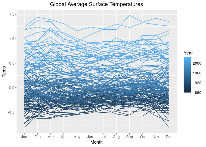
For a color gradient from black to red we can use
p1 + scale_color_gradient(low = "black", high = "red")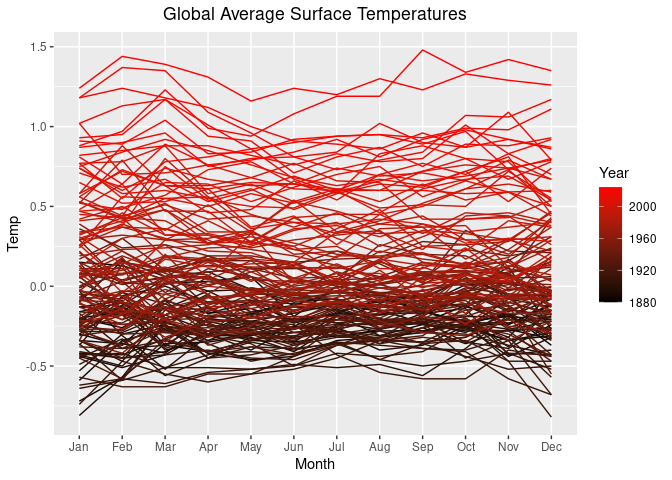
Another possibility is to use a continuous version of the
"Reds" palette from https://colorbrewer2.org:
p2 <- p1 + scale_color_distiller(palette = "Reds", direction = 1)
p2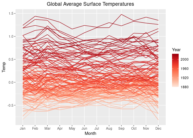
One way to highlight the past_year 2025:
lgast_last <- filter(lgast, Year == past_year)
p2 + geom_line(aes(x = Month, y = Temp, group = Year),
               size = 1, color = "blue", data = lgast_last, na.rm = TRUE)
## Warning: Using `size` aesthetic for lines was deprecated in ggplot2 3.4.0.
## ℹ Please use `linewidth` instead.
## This warning is displayed once per session.
## Call `lifecycle::last_lifecycle_warnings()` to see where this warning was
## generated.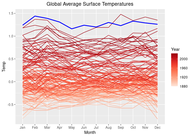
Show full data in gray and data since 2000 in black:
lgast2k <- filter(lgast, Year >= 2000)
ggplot(lgast, aes(x = Month, y = Temp, group = Year)) +
    geom_line(color = "grey80") +
    theme_minimal() +
    geom_line(data = lgast2k)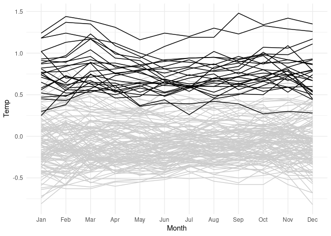
Show the years that set average temperature records:
mt <- group_by(lgast, Year) |>
    summarize(mean_temp = mean(Temp)) |>
    ungroup() |>
    mutate(record = mean_temp == cummax(mean_temp))
lgast <- left_join(lgast, mt, "Year")

library(scales)
ggplot(lgast, aes(Month, Temp, group = Year)) +
    geom_line(color = "grey") + theme_minimal() +
    geom_line(aes(color = Year), data = filter(lgast, record)) +
    scale_color_gradient2(midpoint = 1950,
                          low = muted("blue"),
                          high = muted("red"),
                          mid = muted("purple", l = 60))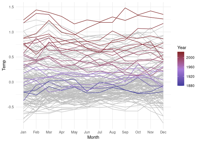
News cycle example
Slightly simplified example from Bob Rudis
library(ggalt)
library(hrbrthemes) # hrbrmstr/hrbrthemes
library(tidyverse)

jsonlite::fromJSON("https://rud.is/dl/2019-axios-news.json") |>
    as_tibble() -> xdf

unnest(xdf, data) |>
    group_by(name) |>
    mutate(idx = seq_len(n())) |>
    ungroup() |>
    ## make a factor for strip/panel ordering
    mutate(name = fct_inorder(name)) -> xdf

sprintf("2019-%02s-1", 1 : 51) |>
    as.Date(format = "%Y-%W-%w") |>
    format("%b") |>
    rle() -> mons
month_idx <- cumsum(mons$lengths) - 3

ggplot(xdf, aes(idx, data)) +
    geom_area(aes(fill = avg, color = avg), alpha = 0.5) +
    geom_hline(data = distinct(xdf, name, avg),
               aes(yintercept = 0, colour = avg), size = 0.5) +
    facet_wrap(~ name, ncol = 1, strip.position = "left", dir = "h") +
    theme(strip.text.y = element_text(angle = 180, hjust = 1, vjust = 0),
          legend.position = "none",
          axis.text.y = element_blank(),
          axis.ticks.y = element_blank(),
          strip.background = element_blank(),
          panel.spacing.y = unit(-0.5, "lines"),
          panel.background = element_blank(),
          panel.grid.major.y = element_blank(),
          panel.grid.major.x = element_line(color = "grey80"),
          panel.grid.minor.x = element_blank()) +
    labs(x = NULL, y = NULL) +
    scale_y_continuous(expand = c(0, 0), limits = c(0, 105)) +
    scale_colour_viridis_c(option = "inferno", direction = -1,
                           begin = 0.1, end = 0.9) +
    scale_fill_viridis_c(option = "inferno", direction = -1,
                         begin = 0.1, end = 0.9) +
    scale_x_continuous(expand = c(0, 0.125), limits = c(1, 51),
                       breaks = month_idx, labels = month.abb)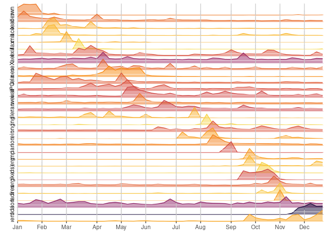
Polar CO2 plot
Mauna Loa CO2 data in polar coordinates:
https://r.iresmi.net/2020/01/01/mauna-loa-co2-polar-plot/
library(ggplot2)
library(dplyr)
co2ml <-
    read.table("https://gml.noaa.gov/webdata/ccgg/trends/co2/co2_mm_mlo.txt")
co2ml <- co2ml[c(1, 2, 4)]
names(co2ml) <- c("year", "month", "co2")

ggplot(co2ml, aes(month, co2, group = year, color = year)) +
    geom_line() +
    scale_color_viridis_c() +
    scale_x_continuous(breaks = 1 : 12, labels = month.abb) +
    coord_polar() +
    labs(x = "",
         y = CO[2] ~ "fraction in dry air (" * mu * "mol/mol)",
         title = paste("Mauna Loa", min(co2ml$year), "-", max(co2ml$year)),
         subtitle = "Monthly mean" ~ CO[2] ~ "concentration") +
    theme_bw() +
    theme(axis.title.y = element_text(hjust = .85),
          panel.grid.major.y = element_blank(),
          panel.grid.minor.x = element_blank(),
          panel.border = element_blank())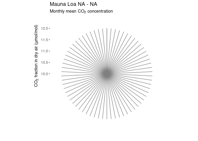
Measles heatmap
From the section on heatmaps in Introduction to Data Science: Data Analysis and Prediction Algorithms with R:
library(RColorBrewer)
library(dslabs)
library(ggplot2)
library(dplyr)
library(ggnewscale)
d <- mutate(us_contagious_diseases,
            rate = 10000 * (count / population) * (52 / weeks_reporting)) |>
    filter(! state %in% c("Alaska", "Hawaii") & disease == "Measles")

hm <- function(d)
    ggplot(d) +
        geom_tile(aes(x = year, y = state, fill = rate)) +
        scale_x_continuous(expand = c(0, 0)) +
        scale_fill_gradientn(colors = brewer.pal(9, "Reds"), trans = "sqrt") +
        new_scale_fill() +
        geom_tile(data = filter(d, is.na(rate)),
                  aes(x = year, y = state, fill = "NA")) +
        scale_fill_manual(values = "grey50") +
        geom_vline(xintercept = 1963, color = "blue") +
        theme_minimal() +
        theme(panel.grid = element_blank(),
              legend.position = "bottom",
              text = element_text(size = 8)) +
        guides(fill = guide_legend(title = NULL, label.position = "bottom"))
hm(d)
Many of the missing values in more recent years may well be zeros.
This data set covers the period 1928-2002. Have things changed since then?
More recent data through 2022 is available from Our World in Data and for 2024-2026 from the CDC. (I was not able to find data for 2023.)
library(tidyr)
base_url <- "https://stat.uiowa.edu/~luke/data/measles/"

## read data through 2022
d1 <- read.csv(paste0(base_url, "owd-measles-2022.csv")) |>
    select(state = Entity, year = Year, rate = 4) |>
    mutate(rate = rate / 10) ## convert to count per 10,000

## read case count data for 2024-2026
d2 <- read.csv(paste0(base_url, "cdc-measles-states-2026.csv")) |>
    select(starts_with("X"), Location)

## read vax data tha includes population counts
v <- read.csv(paste0(base_url, "cdc-measles-vax-2026.csv"))

## convert case counts to rates per 10,000
d3 <- left_join(d2, subset(v,  School.Year=="2024-25") |>
                    select(Location, pop = Population.Size), "Location") |>
    pivot_longer(1:3,
                 values_to = "count",
                 names_to = "year",
                 names_prefix="X",
                 names_transform=as.integer) |>
    mutate(rate = 10000 * count / pop) |>
    select(state = Location, year, rate)

## combine data through 2022 with 2024-2026 data
d4 <- rbind(d1, filter(d3, state %in% d1$state))

## interpolate unavailable 2023 data
d5 <- filter(d4, year == 2022 | year == 2024) |>
    pivot_wider(names_from = "year",
                names_prefix = "X",
                values_from = "rate") |>
    transmute(state, year = 2023, rate = (X2022 + X2024) / 2) |>
    rbind(d4)

complete(d5, state, year) |> filter(year >= 1925) |> hm()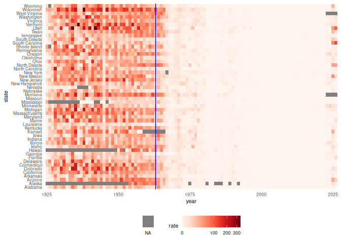
Unfortunately measles cases have become more common again. This is also apparent in a plot of average case rates over time:
summarize(d5, avg_rate = mean(rate, na.rm = TRUE), .by = year) |>
    ggplot(aes(year, avg_rate)) +
    geom_line() +
    theme_minimal()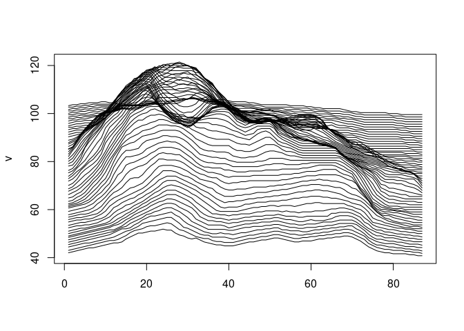
d_raw <- read_csv("US.14189004.csv",
                  col_types = cols(CityName = col_character(),
                                   Admin2Name = col_character(),
                                   PlaceOfAcquisition = col_character()))
d <- distinct(d_raw)
d <- filter(d, PartOfCumulativeCountSeries == 0)
d <- transmute(d,
               state = str_to_title(Admin1Name),
               start = PeriodStartDate,
               count = CountValue,
               city = CityName,
               county = Admin2Name)
ds <- group_by(d, state, start) |>
    summarize(count = sum(count)) |>
    group_by(state, year = year(start)) |>
    summarize(count = sum(count), weeks = n()) |>
    ungroup()
ds <- left_join(ds, select(us_state_populations, -GISJOIN),
                c("state", "year")) |>
    fill(population) |>
    complete(state, year)

lower48 <- setdiff(state.name, c("Hawaii", "Alaska"))
filter(ds, year >= 1930, state %in% lower48) |>
    mutate(rate = 10000 * (count / population) * (52 / weeks)) |>
    hm
Squirrels in central park
https://flowingdata.com/2020/01/09/squirrel-census-count-in-central-park/ https://data.cityofnewyork.us/Environment/2018-Central-Park-Squirrel-Census-Squirrel-Data/vfnx-vebw
Ridgeline map
https://flowingdata.com/2020/01/06/draw-a-ridgeline-map-showing-elevation-for-anywhere-on-earth/
Base graphics:
v <- sweep(80 * volcano / max(volcano), 2, 1 : 61, FUN = `+`)
matplot(v, type = "l", col = "black", lty = 1)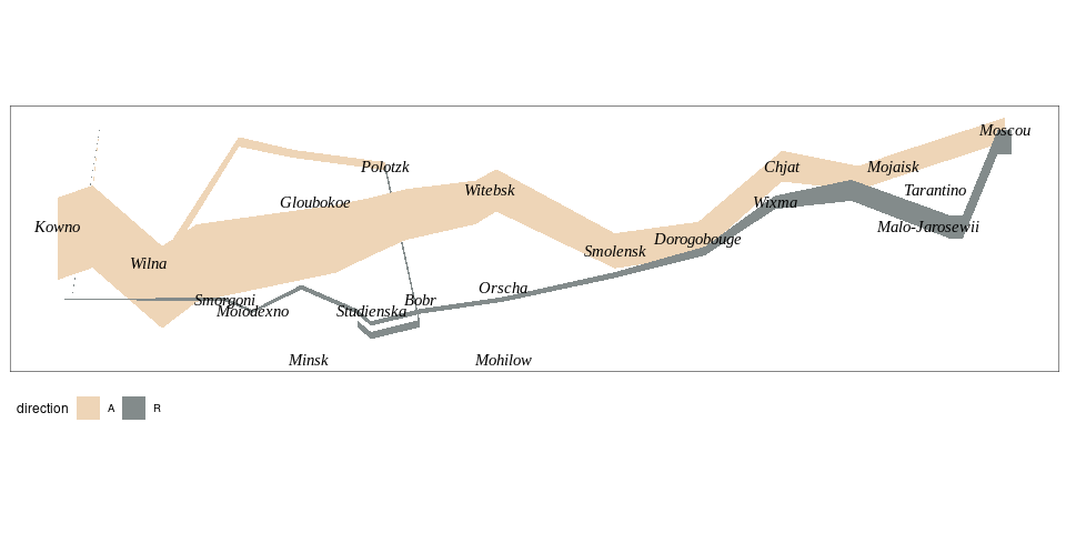
ggplot:
vd <- data.frame(value = as.numeric(volcano),
                 row = rep(seq_len(nrow(volcano)), ncol(volcano)),
                 col = rep(seq_len(ncol(volcano)), each = nrow(volcano)))

vd <- mutate(vd, y = 20 * (value / max(value)) + col)

p1 <- ggplot(vd, aes(x = row, y = y, group = rev(col))) +
    geom_polygon(fill = "white", color = "black") +
    theme_void()

p2 <- ggplot(vd, aes(x = row, ymax = y, ymin = min(y), group = rev(col))) +
    geom_ribbon(fill = "white", color = "black") +
    theme_void()

p0 <- ggplot(vd, aes(x = row, y = y, group = rev(col))) +
    geom_line() +
    theme_void()

p0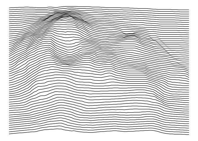
p1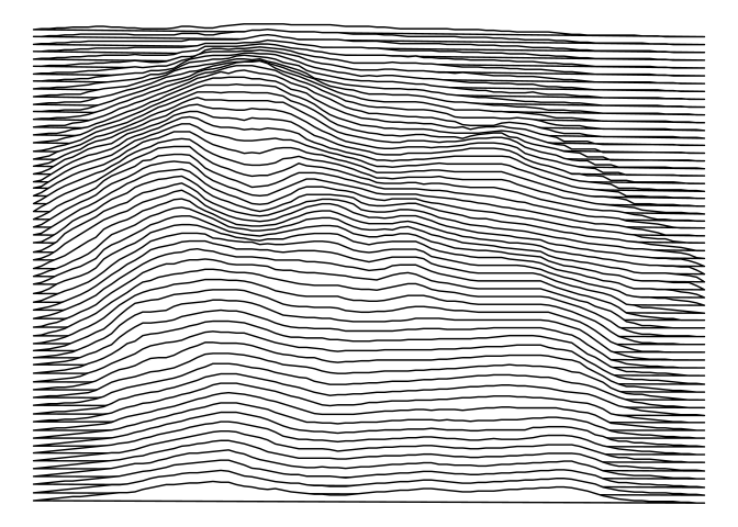
p2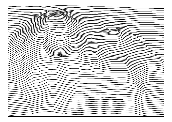
p0 + coord_fixed(ratio = ncol(volcano) / nrow(volcano))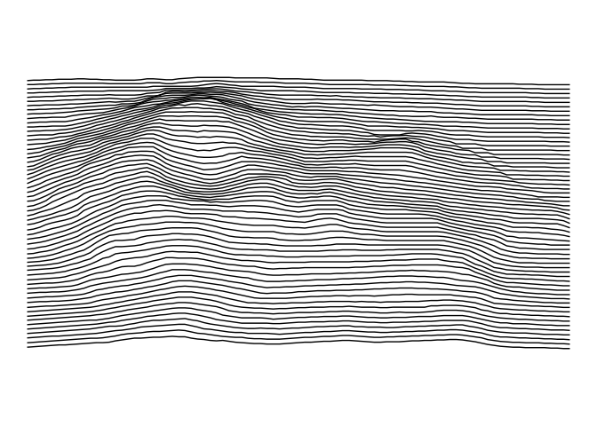
p1 + coord_fixed(ratio = ncol(volcano) / nrow(volcano))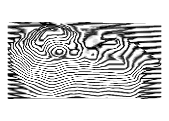
p2 + coord_fixed(ratio = ncol(volcano) / nrow(volcano))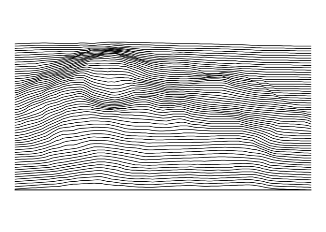
Minard’s Graph of Napoleon’s Russia Campaign
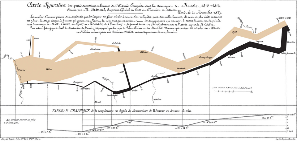
The Basic Map
Adapted from Rahlf’s book.
library(tidyverse)
library(HistData)
library(ggthemes)
all <- mutate(Minard.troops, hwidth = survivors / 1000000)
grp1 <- filter(all, group == 1)
grp2 <- filter(all, group == 2)
grp3 <- filter(all, group == 3)
p <- ggplot(NULL, aes(x = long,
                      ymin = lat - hwidth,
                      ymax = lat + hwidth,
                      fill = direction)) +
    geom_ribbon(data = grp2[1 : 8, ]) +
    geom_ribbon(data = grp2[8 : 10, ]) +
    geom_ribbon(data = grp3) +
    geom_ribbon(data = grp1) +
    geom_text(aes(x = long, y = lat, label = city),
              size = 2,
              family = "Times New Roman", fontface = "italic", ##"Felipa",
              data = Minard.cities, inherit.aes = FALSE) +
    scale_fill_manual(values = c(A = "bisque2", R = "azure4")) +
    coord_quickmap() +
    theme_map() +
    theme(panel.border = element_rect(fill = NA, colour = "grey20")) +
    theme(legend.position = "bottom")
p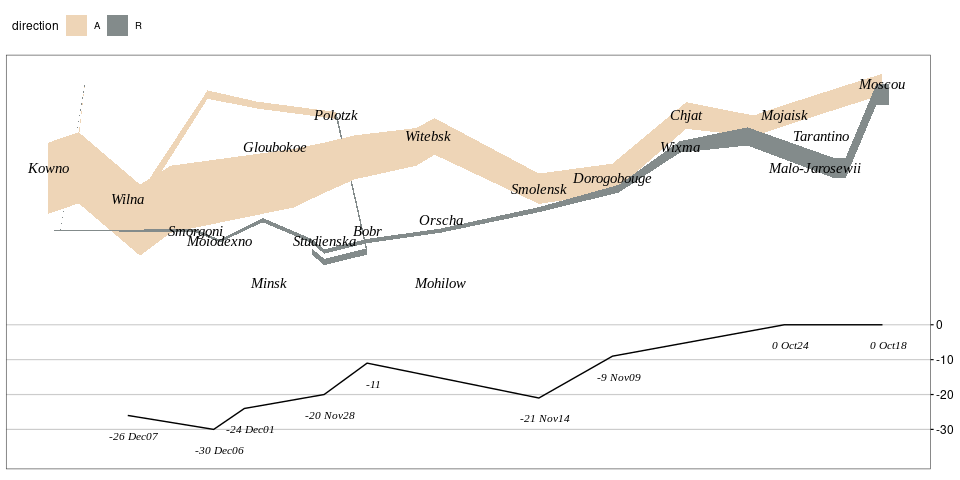
## May need this first
library(extrafont)
font_import()
Adding the temperature graph:
temp_zero <- 53.5
temp_scale <- 30
temp_breaks <- c(-30, -20, -10, 0)
temps <- mutate(Minard.temp,
                lat = temp_zero + temp / temp_scale,
                temp_label = ifelse(is.na(date), temp, paste(temp, date)))
p + theme(legend.position = "top") +
    geom_line(aes(x = long, y = lat), data = temps, inherit.aes = FALSE) +
    geom_text(aes(x = long, y = lat, label = temp_label),
              data = temps, nudge_y = -0.2, nudge_x = 0.1,
              fontface = "italic", family = "Times New Roman", size = 3,
              inherit.aes = FALSE) +
    scale_y_continuous(position = "right",
                       breaks = temp_zero + temp_breaks / temp_scale,
                       labels = temp_breaks) +
    theme(axis.text.y = element_text(),
          axis.ticks.y = element_line(),
          panel.grid.major.y = element_line(color = "grey80"))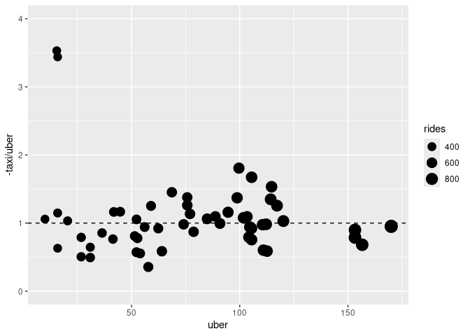
Adding Rivers in the Background
library(rnaturalearth)
rivers10 <- ne_download(scale = 10, type = 'rivers_lake_centerlines',
                        destdir = getwd(),
                        category = 'physical')

a <- aes(x = long, ymin = lat - hwidth, ymax = lat + hwidth, fill = direction)

p1 <- ggplot(sf::st_crop(rivers10,
                   c(xmin = 23, ymin = 53.75, xmax = 39.25, ymax = 57.15))) +
    geom_sf(linewidth = 0.1) +
    geom_ribbon(a, data = grp2[1 : 8, ]) +
    geom_ribbon(a, data = grp2[8 : 10, ]) +
    geom_ribbon(a, data = grp3) +
    geom_ribbon(a, data = grp1) +
    geom_text(aes(x = long, y = lat, label = city),
              size = 2,
              family = "Times New Roman", fontface = "italic", ##"Felipa",
              data = Minard.cities, inherit.aes = FALSE) +
    scale_fill_manual(values = c(A = "bisque2", R = "azure4")) +
    theme_map() +
    theme(panel.border = element_rect(fill = NA, colour = "grey20")) +
    theme(legend.position = "bottom")
## Warning: attribute variables are assumed to be spatially constant throughout
## all geometries
p1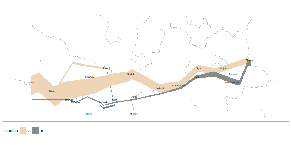
library(ggrepel)
temp_breaks <- c(-30, -20, -10, 0)
temps <- mutate(Minard.temp,
                temp_label = ifelse(is.na(date), temp, paste(temp, date)))
p2 <- ggplot(temps, aes(x = long, y = temp)) +
    geom_line() +
    geom_text_repel(aes(x = long, y = temp, label = temp_label),
                    fontface = "italic", family = "Times New Roman", size = 3,
                    inherit.aes = FALSE) +
     scale_y_continuous(position = "right",
                        breaks = temp_breaks,
                        labels = temp_breaks) +
     theme_bw() +
     theme(axis.text.y = element_text(),
           axis.ticks.y = element_line(),
           panel.grid.major.y = element_line(color = "grey80"),
           panel.grid.minor = element_blank(),
       panel.grid.major.x = element_blank(),
           axis.title.x = element_blank(),
       axis.text.x = element_blank(),
       axis.ticks.x = element_blank(),
       axis.title = element_text(family = "Times New Roman", face = "italic")) +
     coord_fixed(ratio = 0.1) +
     labs(y = "Celcius")

library(patchwork)

((p1 + theme(legend.position = "top")) / p2) + xlim(c(23, 39.25)) & theme(plot.margin = margin(0, 0, 0, 0, "pt"))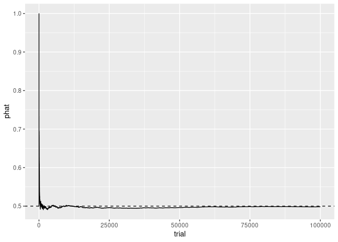
With a (Modern) Background Map
library(ggmap)
keys <- as.data.frame(read.dcf(here::here("../APIKEYS")))
StadiaKey <- keys$key[match("Stadia", keys$name)]
register_stadiamaps(StadiaKey, write = FALSE)

basemap <- get_stadiamap(bbox = c(left =  23,
                                  bottom = 53.75,
                                  right = 39.25,
                                  top = 57.15),
                         maptype = "stamen_toner_background",
                         zoom = 7)

p3 <- ggmap(basemap) +
    geom_ribbon(a, data = grp2[1 : 8, ]) +
    geom_ribbon(a, data = grp2[8 : 10, ]) +
    geom_ribbon(a, data = grp3) +
    geom_ribbon(a, data = grp1) +
    geom_text(aes(x = long, y = lat, label = city),
              size = 2,
              family = "Times New Roman", fontface = "italic", ##"Felipa",
              data = Minard.cities, inherit.aes = FALSE) +
    scale_fill_manual(values = c(A = "bisque2", R = "azure4")) +
    theme_map() +
    theme(legend.position = "top", legend.justification = "left")

(p3 / p2)  + xlim(c(23, 39.25)) & theme(plot.margin = margin(0, 0, 0, 0, "pt"))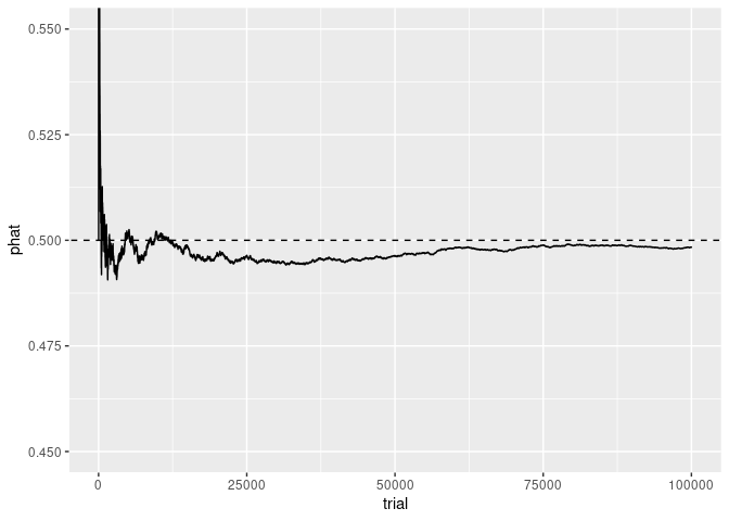
Is Uber Replacing Taxis in Central Manhattan?
Overall pickups among taxis, Uber, and similar services changed very little within central Manhattan from 2014 to 2015.
Taxi pickups decreased and Uber pickups increased. Was this a substitution of Uber for taxis?
An article on the FiveThirtyEight examines this question with a graph:
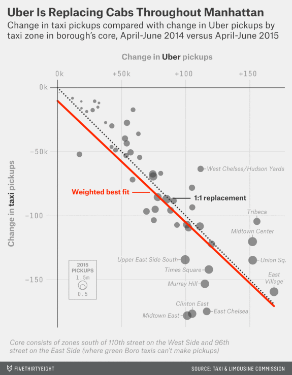
- Items: Taxi zones in Mahattan’s core.
- Attributes/variables:
- change in taxi pickups
- change in Uber pickups
- total number of pickups in the 2015 period
- Marks: points.
- Channels:
- horizontal position, mapped to Uber change
- vertical position, mapped to taxi change
- point size, mapped to total number of pickups
- Supporting features:
- Negative 45 degree line
- Regression line
- Annotations
An approximate reconstruction using an approximation to the data in the graph:
if (! file.exists("nyuber.dat"))
    download.file("https://stat.uiowa.edu/~luke/data/nyuber.dat",
                  "nyuber.dat")
tu <- read.table("nyuber.dat", head = TRUE)
ggplot(tu, aes(x = uber, y = taxi)) +
    geom_point(aes(size = rides)) +
    geom_abline(slope = -1, linetype = 2) +
    geom_smooth(method = "lm", se = FALSE, color = "red") +
    scale_size_area()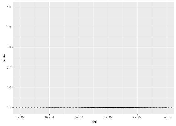
The primary question is to what degree at the zone level decreases in taxi pickups match increases in Uber pickups.
The strongest channels, 2D position, have been used for the two change variables.
Answering the question requires assessing the position of a point relative to the 1:1 replacement line. This is much harder than assessing position relative to an axis.
An alternate approach is to plot the number of taxi pickups lost per Uber ride gained against uber gains or taxi losses:
This allows the taxi/tradeoff to be assessed by comparison to a common scale.
Several other variations are possible.
Law of Large Numbers Simulation
Automated choices of axis scaling can affect the aspect ratio of the content of a plot.
A simple simulation of coins flips to illustrate the law of large numbers:
n <- 100000
prob <- 0.5
flips <- data.frame(trial = 1 : n, flip = rbinom(n, 1, prob))
library(dplyr)
flips <- mutate(flips, phat = cumsum(flip) / trial)
head(flips, 10)
##    trial flip      phat
## 1      1    1 1.0000000
## 2      2    1 1.0000000
## 3      3    1 1.0000000
## 4      4    1 1.0000000
## 5      5    0 0.8000000
## 6      6    1 0.8333333
## 7      7    1 0.8571429
## 8      8    0 0.7500000
## 9      9    1 0.7777778
## 10    10    1 0.8000000
p <- ggplot(flips, aes(x = trial, y = phat)) +
geom_line() +
geom_abline(intercept = prob, slope = 0, lty = 2)
p
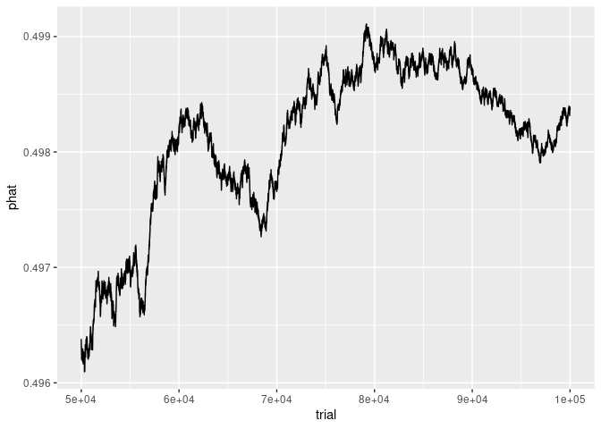
Focusing the y axis around 1/2 shows the early
fluctuations near 1/2 more clearly:
p + coord_cartesian(ylim = c(0.45, 0.55))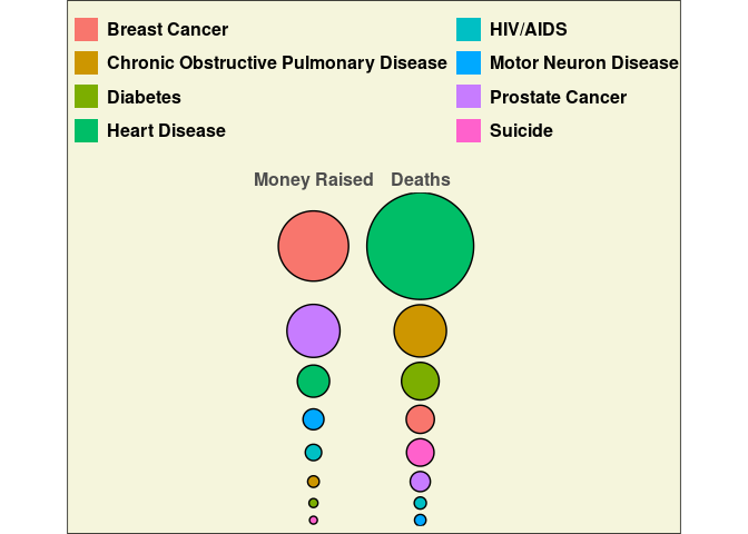
p + ylim(c(0.45, 0.55))
## Warning: Removed 29 rows containing missing values or values outside the scale range
## (`geom_line()`).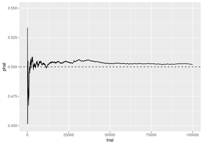
Focusing on the x axis for the last half of the trials
shows that, as expected, the sample proportion is very close to 1/2.
The y axis scale still reflects the range of the
complete data.
p + coord_cartesian(xlim = c(50000, 100000))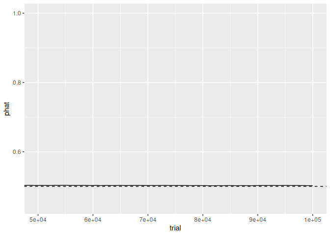
Using a subset of the data for trials >= 50000
produces a very different picture that emphasizes the details of the
fluctuations:
## Warning: Removed 1 row containing missing values or values outside the scale range
## (`geom_segment()`).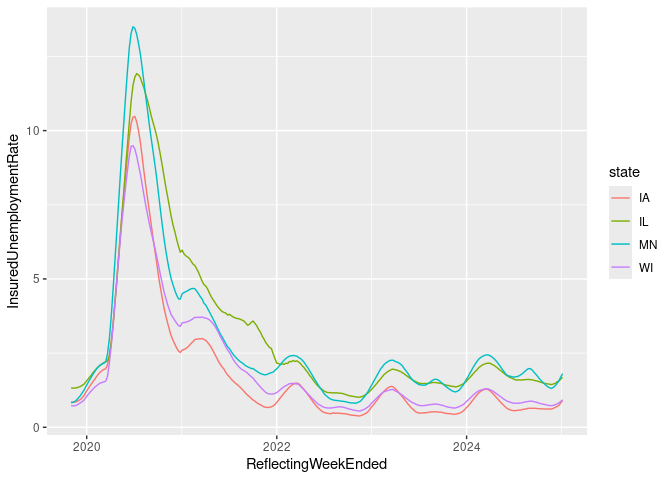
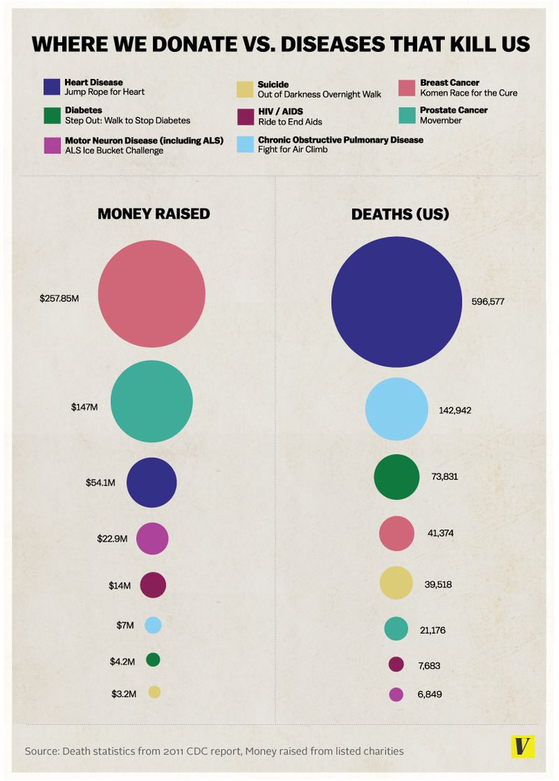
Vox Plot Reconstruction
Reconstruction of the revised Vox chart in the article on the ice bucket challenge.
library(ggplot2)

d <- read.csv("https://stat.uiowa.edu/~luke/data/dfunds.csv")

## dd <- data.frame(var = rep(c("Money Raised", "Deaths"), each = nrow(d)),
##                  val = c(d$Funding, d$Deaths / 1000),
##                  rank = c(rank(d$Funding), rank(d$Deaths)),
##                  Disease = rep(d$Disease, 2))

dd <- mutate(d, Deaths = Deaths / 1000) |>
    rename("Money Raised" = Funding) |>
    pivot_longer(-Disease, names_to = "var", values_to = "val") |>
    group_by(var) |>
    mutate(rank = rank(val)) |>
    ungroup()

ggplot(dd, aes(x = var, y = rank)) +
    geom_line(aes(group = Disease)) +
    geom_point(aes(color = Disease, size = val)) +
    geom_text(aes(label = round(val),
                  hjust = ifelse(var == "Deaths", "left", "right"),
                  x = ifelse(var == "Deaths",
                             2 + 0.01 + sqrt(val) / 120,
                             1 - 0.01 - sqrt(val) / 120))) +
    scale_size_area(max_size = 25) +
    scale_x_discrete(position = "top",
                     limits = c("Money Raised", "Deaths")) +
    scale_y_continuous(expand = c(0, 0), limits = c(0, 9)) +
    theme_minimal() +
    theme(axis.title = element_blank(),
          axis.text.y = element_blank(),
          axis.ticks.y = element_blank(),
          text = element_text(size = 15, face = "bold"),
          legend.position = "top") +
    guides(color = guide_legend(override.aes = list(size = 5),
                                nrow = 4,
                                title = NULL),
           size = "none")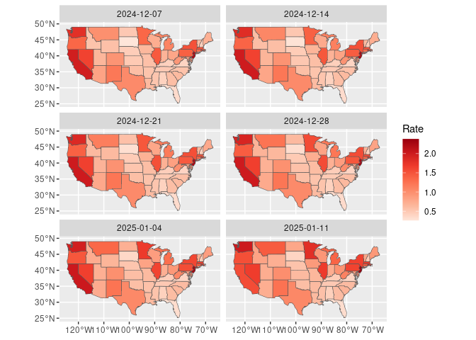
Variant:
d1 <- mutate(d,
             var = "Deaths",
             val = Deaths / 1000,
             rank = rank(Deaths))
d2 <- mutate(d,
             var = "Money Raised",
             val = Funding,
             rank = rank(Funding))
ggplot(NULL, aes(x = var, y = rank, size = val, color = Disease)) +
    geom_point(data = d2) +
    geom_point(data = d1) +
    scale_size_area(max_size = 25, guide = "none") +
    scale_x_discrete(name = NULL,
                     position = "top",
                     limits = c("Money Raised", "Deaths")) +
    scale_y_continuous(name = NULL,
                       expand = c(0, 0),
                       limits = c(0, 9))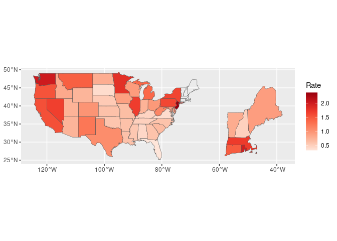
Can also ggforce::geom_circle. More painful but a nicer
looking result.
library(ggforce)

gap <- 0.1

centr <- function(r) {
    n <- length(r)
    sr <- sort(r)
    b <- cumsum(c(0, gap + 2 * sr[-n]))
    (b + sr)[rank(r)]
}

ddr <- mutate(dd,
              r = sqrt(val / max(val)),
              x0 = ifelse(var == "Deaths", 3, 1)) |>
    group_by(var) |>
    mutate(y0 = centr(r)) |>
    ungroup()
ddrr <- group_by(ddr, rank) |> mutate(y0 = max(y0))

ggplot(ddrr) +
    geom_circle(aes(x0 = x0, y0 = y0 + gap, r = r, fill = Disease)) +
    coord_fixed() +
    scale_x_continuous(position = "top",
                       breaks = c(1, 3),
                       labels = c("Money Raised", "Deaths"),
                       expand = c(0.8, 0.8)) +
    scale_y_continuous(expand = c(0, 0)) +
    theme_minimal() +
    theme(panel.grid = element_blank(),
          legend.position = "top",
          axis.title = element_blank(),
          axis.text.y = element_blank(),
          axis.ticks.y = element_blank(),
          text = element_text(size = 15, face = "bold"),
          plot.background = element_rect(fill = "beige")) +
    guides(fill = guide_legend(nrow = 4,
                               title = NULL,
                               override.aes = list(color = NA)))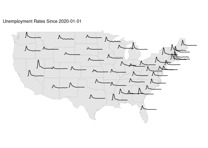
Weekly US Unemployment
I have not yet been able to find county level weekly unemployment data.
State level data is available from the US Department of Labor via a web interface or a page for downloading CSV files.
The most appropriate data is ETA 539. A skeletal variable description file is available.
Based on that description file and the data from the web interface the useful variables seem to be:
| Variable | Meaning |
|---|---|
st |
State |
rptdate |
Filed Week Ended |
c2 |
Reflecting Week Ended |
c3 |
Initial Claims |
c8 |
Continued Claims |
c18 |
Covered Employment |
c19 |
Insured Unemployment Rate |
Read and clean the data.
## **** move this to top of file
options(conflicts.policy = list(depends.ok = TRUE, warn = FALSE))

suppressMessages(library(tidyverse))
library(lubridate)

unemp_file <- "ar539.csv"
unemp_url <- "https://oui.doleta.gov/unemploy/csv/ar539.csv"
if (! file.exists(unemp_file) ||
    now() > file.mtime(unemp_file) + weeks(1))
    download.file(unemp_url, unemp_file)
ud <- read.csv(unemp_file)
ud <- transmute(ud,
                state = st,
                weekEnded = mdy(rptdate),
                ReflectingWeekEnded = mdy(c2),
                InitialClaims = c3,
                ContinuedClaims = c8,
                CoveredEmployment = c18,
                InsuredUnemploymentRate = c19)
Some time series:
filter(ud, state %in% c("IA", "IL", "WI", "MN"),
     ReflectingWeekEnded > "2019-11-01") |>
     ggplot(aes(x = ReflectingWeekEnded,
                y = InsuredUnemploymentRate,
                color = state)) +
     geom_line()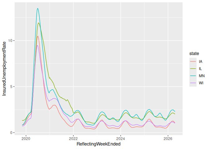
Choropleth maps for the last 6 weeks:
states_sf <- sf::st_as_sf(maps::map("state", plot = FALSE, fill = TRUE),
                          csr = 4326)

ud1 <- rename(ud, ID = state) |>
    mutate(ID = tolower(tolower(state.name[match(ID, state.abb)])))
udf_sf <- mutate(states_sf, ID = as.character(ID)) |> left_join(ud1, "ID")
filter(udf_sf, weekEnded >= max(weekEnded, na.rm = TRUE) - weeks(5)) |>
    rename(Rate = InsuredUnemploymentRate) |>
    ggplot(aes(fill = Rate)) +
    geom_sf() +
    coord_sf() +
    facet_wrap(~weekEnded, ncol = 2) +
    scale_fill_distiller(palette = "Reds", direction = 1)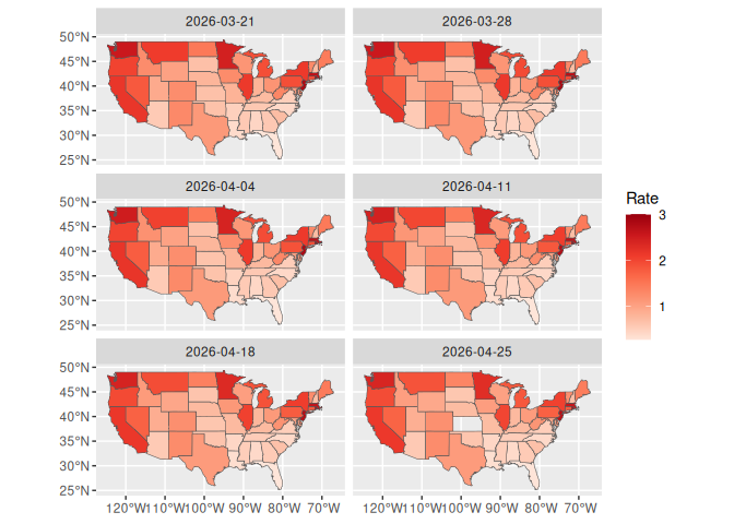
For the most recent period break out north-east states:
library(sf)
udf2_sf <- filter(udf_sf, weekEnded == max(weekEnded, na.rm = TRUE)) |>
    rename(Rate = InsuredUnemploymentRate)
NE <- c("maine", "vermont", "new hampshire", "massachusetts",
        "rhode island", "connecticut")
NE_sf <- filter(udf2_sf, ID %in% NE)
NE2_sf <- st_set_crs(st_set_geometry(NE_sf,
                     (st_geometry(NE_sf) - c(-71, 42.3)) * 3 + c(-50, 30)),
                     4326)
ggplot(NULL, aes(fill = Rate)) +
    geom_sf(data = NE2_sf) +
    geom_sf(data = filter(udf2_sf, ! ID %in% NE)) +
    geom_sf(data = mutate(NE_sf, Rate = NULL), fill = NA) +
    coord_sf() +
    scale_fill_distiller(palette = "Reds", direction = 1)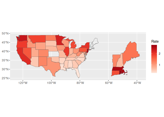
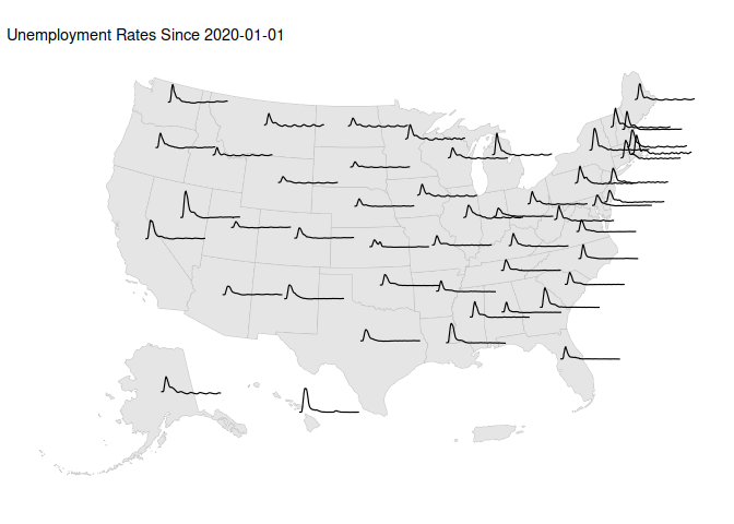
Unemployment time series spark line plot motivated by an example for France.
sf::sf_use_s2(FALSE)
states_sf <- cbind(states_sf, st_coordinates(st_centroid(states_sf)))
## Warning: st_centroid assumes attributes are constant over geometries
## Warning in st_centroid.sfc(st_geometry(x), of_largest_polygon =
## of_largest_polygon): st_centroid does not give correct centroids for
## longitude/latitude data
sf::sf_use_s2(TRUE)
start <- "2020-01-01"
udf3_sf <-
    mutate(states_sf, ID = as.character(ID)) |>
    left_join(filter(ud1, weekEnded >= start), "ID") |>
    mutate(weeks = as.integer(difftime(weekEnded, ymd(start), units = "weeks")))

ggplot(states_sf) +
    geom_sf(color = "grey") +
    geom_line(aes(X + 0.015 * weeks,
                  Y + 0.1 * InsuredUnemploymentRate,
                  group = ID),
              data = udf3_sf) +
    ggtitle(paste("Unemployment Rates Since", start)) +
    ggthemes::theme_map()
## Warning: Removed 1 row containing missing values or values outside the scale range
## (`geom_line()`).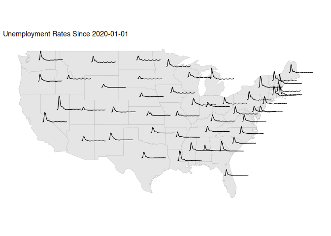
A variant including Alaska and Hawaii:
library(usmap)
usa_ha = us_map()
usa_ha <- cbind(usa_ha, st_coordinates(st_centroid(usa_ha)))
## Warning: st_centroid assumes attributes are constant over geometries

udf4_sf <-
    mutate(usa_ha, ID = tolower(as.character(full))) |>
    left_join(filter(ud1, weekEnded >= start), "ID") |>
    mutate(weeks = as.integer(difftime(weekEnded, ymd(start), units = "weeks")))

ggplot(usa_ha) +
    geom_sf(color = "grey") +
    geom_line(aes(X + 1500 * weeks,
                  Y + 10000 * InsuredUnemploymentRate,
                  group = ID),
              data = udf4_sf) +
    ggtitle(paste("Unemployment Rates Since", start)) +
    ggthemes::theme_map()
## Warning: Removed 2 rows containing missing values or values outside the scale range
## (`geom_line()`).