Strip Plots
Some Features to Look For
Some things to keep an eye out for when looking at data on a numeric variable:
skewness, multimodality
gaps, outliers
rounding, e.g. to integer values, or heaping, i.e. a few particular values occur very frequently
impossible or suspicious values
Strip Plots
Basics
A variant of the dot plot is known as a strip plot. A strip plot for the city temperature data is
p1 <- stripplot(~ temp, data = citytemps)
p2 <- ggplot(citytemps) + geom_point(aes(x = temp, y = "All"))
grid.arrange(p1, p2, nrow = 1)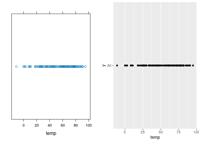
One way to reduce the vertical space is to use the chunk option fig.height = 2, which produces

The strip plot can reveal gaps and outliers.
After looking at the plot we might want to examine the high and low values:
filter(citytemps, temp > 85)
##            city temp
## 1      Asuncion   99
## 2 Dar es Salaam   92
## 3      Kingston   87
## 4      Kinshasa   89
## 5       Managua   90
## 6      Santiago   88
## 7 Santo Domingo   88
filter(citytemps, temp < 10)
##     city temp
## 1 Almaty    9
## 2 Anadyr  -23
Multiple Samples
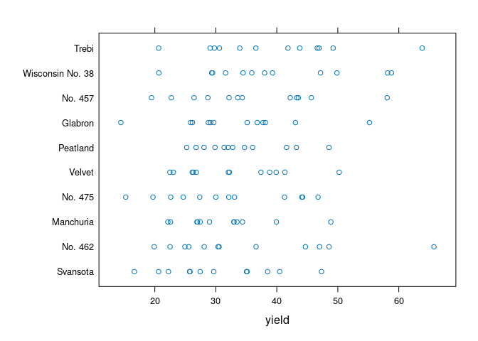
The strip plot is most useful for showing subsets corresponding to a categorical variable.
A strip plot for the yields for different varieties in the barley data is
ggplot(barley) + geom_point(aes(x = yield, y = variety))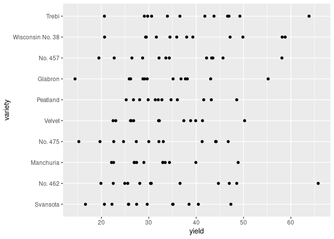
Scalability
Scalability in this form is limited due to over-plotting.
A simple strip plot of price within the different cut levels in the diamonds data is not very helpful:
ggplot(diamonds) + geom_point(aes(x = price, y = cut))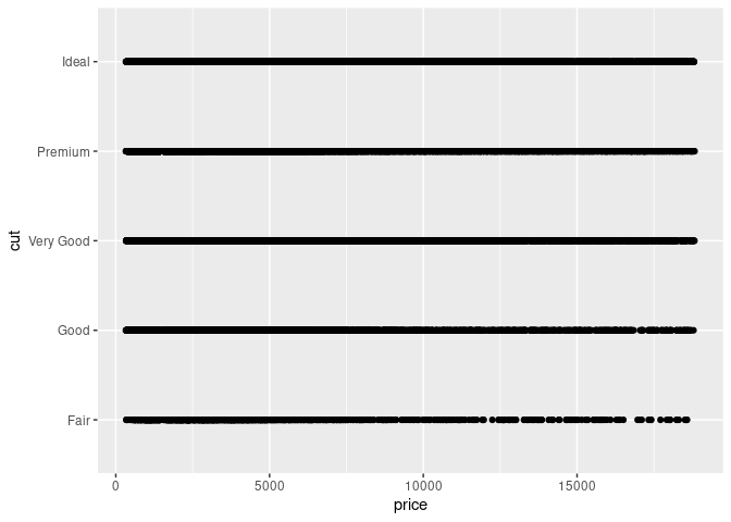
Several approaches are available to reduce the impact of over-plotting:
reduce the point size;
random displacement of points, called jittering;
making the points translucent, or alpha blending.
Combining all three produces
ggplot(diamonds) +
    geom_point(aes(x = price, y = cut),
               size = 0.2, position = "jitter", alpha = 0.2)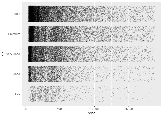
Skewness of the price distributions can be seen in this plot, though other approaches will show this more clearly.
A peculiar feature reveled by this plot is the gap below 2000. Examining the subset with price < 2000 shows the gap is roughly symmetric around 1500:
ggplot(filter(diamonds, price < 2000)) +
    geom_point(aes(x = price, y = cut),
               size = 0.2, position = "jitter", alpha = 0.2)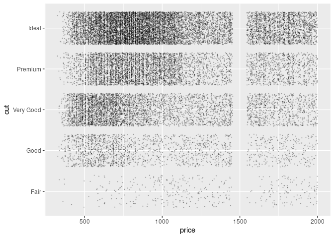
Some Notes
With a good combination of point size choice, jittering, and alpha blending the strip plot for groups of data can scale to several hundred thousand observations and ten to twenty of groups.
Strip plots can reveal gaps, outliers, and data outside of the expected range.
Skewness and multi-modality can be seen, but other visualizations show these more clearly.
Storage needed for vector graphics images grows linearly with the number of observations.
Base graphics provides stripchart:
stripchart(yield ~ variety, data = barley)
Lattice provides stripplot:
stripplot(variety ~ yield, data = barley)