Visualizing Two Numeric Variables
Slope Graphs
The most used graph for visualizing the relationship between two numeric variables is the scatter plot.
But there is one alternative that can be useful and is increasingly popular: the slope chart or slope graph.
Tufte’s Slope Graph
Two articles on slope graphs with examples:

Tufte showed this example in The Visual Display of Quantitative Information.
Some features of the data that are easy to see:
order of the countries within each year;
how each country’s values changed;
how the rates of change compare;
the country (Britain) that does not fit the general pattern.
The chart uses no non-data ink. (Tufte thinks this is important; others disagree).
The chart in this form is well suited for small data sets or summaries with modest numbers of categories.
Scalability in this full form is limited, but better if labels and values are dropped.
The idea can be extended to multiple periods, though two periods or levels is most common when labeling is used.
Without labeling this becomes a parallel coordinates plot.
A multi-period example: 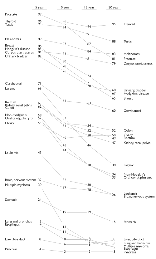
Barley Mean Yields
A slope graph for the average yields at each experiment station for the two years 1931 and 1932:
theme_set(theme_minimal() + theme(text = element_text(size = 16)))
library(ggrepel)
library(forcats)
data(barley, package = "lattice")
barley_site_year <- group_by(barley, site, year) |>
    summarize(avg_yield = mean(yield)) |>
    mutate(year = fct_rev(year))
barley_site_year_1932 <- filter(barley_site_year, year == "1932")
ggplot(barley_site_year, aes(x = year, y = avg_yield, group = site)) +
    geom_line() +
    geom_text_repel(aes(label = site),
                    data = barley_site_year_1932,
                    hjust = "left", direction = "y") +
    scale_x_discrete(expand = expansion(mult = c(0.1, .3)),
                     position = "top") +
    labs(x = NULL, y = "Average Yield") +
    theme(axis.line.y.left = element_line(),
          axis.ticks.y.left = element_line())
The anomalous result for Morris pops out very clearly.
This graph departs from the classic Tufte style:
it uses an axis instead of showing the numbers;
only shows labels on one side.
This is similar to the style used here.
Creating the Graph
The first step is to compute the averages:
barley_site_year <- group_by(barley, site, year) |>
    summarize(avg_yield = mean(yield))
head(barley_site_year, 2)
## # A tibble: 2 × 3
## # Groups:   site [1]
##   site         year  avg_yield
##   <fct>        <fct>     <dbl>
## 1 Grand Rapids 1932       20.8
## 2 Grand Rapids 1931       29.1
The year variable is a factor with the levels in the wrong order, so we need to fix that:
levels(barley_site_year$year)
## [1] "1932" "1931"
barley_site_year <- mutate(barley_site_year, year = fct_rev(year))
levels(barley_site_year$year)
## [1] "1931" "1932"
Set the default theme to theme_minimal with larger text:
theme_set(
    theme_minimal() +
    theme(text = element_text(size = 16)))
The core of a slope graph is produced by
p <- ggplot(barley_site_year,
            aes(x = year,
                y = avg_yield,
                group = site)) +
    geom_line()
p
Adding the labels on the 1932 side can be done as
barley_site_year_1932 <-
    filter(barley_site_year, year == "1932")
p + geom_text(aes(label = site),
              data = barley_site_year_1932,
              hjust = "left")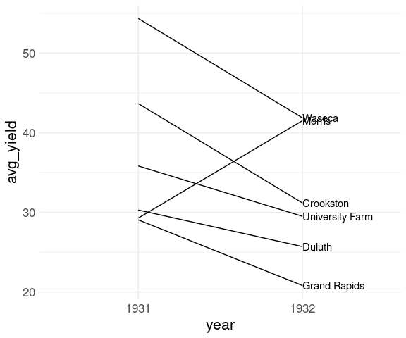
The label positions could use further adjusting.
Using geom_text_repel from the ggrepel package handles this well:
library(ggrepel)
p <- p +
    geom_text_repel(
        aes(label = site),
        data = barley_site_year_1932,
        hjust = "left",
        direction = "y")
p
Adjust the x scale:
p <- p +
    scale_x_discrete(
        expand = expansion(mult = c(0.1, .3)),
        position = "top")
p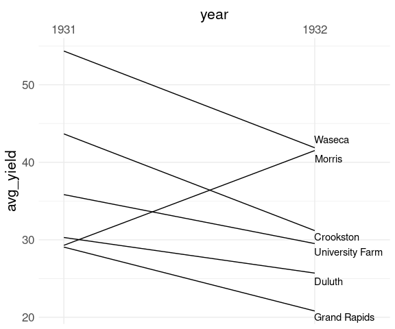
Final theme adjustments:
p + labs(x = NULL,
         y = "Average Yield") +
    theme(axis.line.y.left = element_line(),
          axis.ticks.y.left = element_line())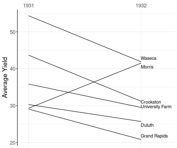
Father-Son Heights
The father.son data set has 1078 observations, which is too large for the labeled slope graph, but the basic representation is useful:
library(tidyr)
fs <-
    mutate(father.son,
           id = seq_len(nrow(father.son))) |>
    pivot_longer(1 : 2,
                 names_to = "which",
                 values_to = "height")
ggplot(fs, aes(x = which, y = height)) +
    geom_line(aes(group = id), alpha = 0.1) +
    scale_x_discrete(
        expand = expansion(mult = c(.1, .1)),
        labels = c("Father", "Son"),
        position = "top") +
    labs(x = NULL, y = "Height (Inches)")
This very clearly shows the famous regression to the mean effect:
- taller parents tend to be taller than their children;
- shorter parents tend to be shorter than their children.
Conversely,
- taller children tend to be taller than their parents;
- shorter children tend to be shorter than their parents.
Creating the Graph
To make creating the graph easier we can convert the data frame into a longer form with variables
height, the height measurementwhich,fheightorsheightid, identifying the pair:
Add the id variable:
fs <- mutate(father.son,
             id = seq_len(nrow(father.son)))
head(fs)
##    fheight  sheight id
## 1 65.04851 59.77827  1
## 2 63.25094 63.21404  2
## 3 64.95532 63.34242  3
## 4 65.75250 62.79238  4
## 5 61.13723 64.28113  5
## 6 63.02254 64.24221  6
Pivot to the longer format:
fs <- pivot_longer(fs, 1 : 2,
                   names_to = "which",
                   values_to = "height")
head(fs)
## # A tibble: 6 × 3
##      id which   height
##   <int> <chr>    <dbl>
## 1     1 fheight   65.0
## 2     1 sheight   59.8
## 3     2 fheight   63.3
## 4     2 sheight   63.2
## 5     3 fheight   65.0
## 6     3 sheight   63.3
The basic plot is quite simple:
ggplot(fs, aes(x = which,
               y = height,
               group = id)) +
    geom_line()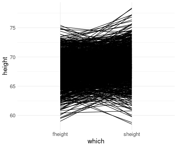
With an alpha adjustment to reduce over-plotting:
ggplot(fs, aes(x = which,
               y = height,
               group = id)) +
    geom_line(alpha = 0.1)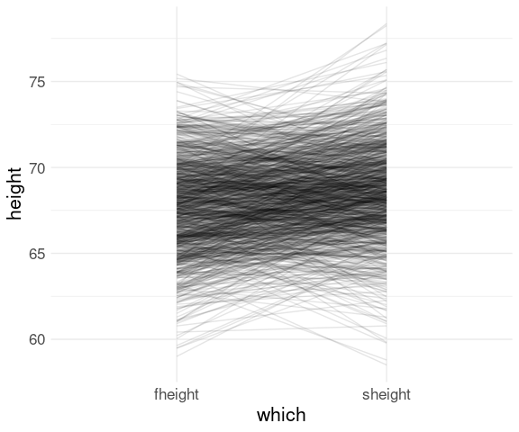
With scale and label adjustments:
ggplot(fs, aes(x = which,
                    y = height,
                    group = id)) +
    geom_line(alpha = 0.1) +
    scale_x_discrete(
        expand = expansion(mult = c(.1, .1)),
        labels = c("Father", "Son"),
        position = "top") +
    labs(x = NULL, y = "Height (Inches)")
Scatter Plots
The most common way to show the relationship between two variables is a scatter plot.
A scatter plot of two variables maps the values of one variable to the vertical axis and the other to the horizontal axis of a cartesian coordinate system and places a mark for each observation at the resulting point.
Some conventions:
Plot
Aversus/againstBmeansAis mapped to the vertical, or \(y\), axis, andBto the horizontal, or \(x\) axis.If we can think of variation in
Aas being partly explained byBthen we usually plotAagainstB.If we can think of
Bas helping to predictA, then we usually plotAagainstB.
Barley Yields
For a scatter plot of mean yield in 1932 against mean yield in 1931 for the different sites it is useful to have a data frame containing variables for each year.
This requires converting the data frame to a wider format.
wide_barley_site_year <- pivot_wider(barley_site_year,
                                     names_from = "year",
                                     names_prefix = "avg_yield_",
                                     values_from = "avg_yield")
head(wide_barley_site_year)
## # A tibble: 6 × 3
## # Groups:   site [6]
##   site            avg_yield_1932 avg_yield_1931
##   <fct>                    <dbl>          <dbl>
## 1 Grand Rapids              20.8           29.1
## 2 Duluth                    25.7           30.3
## 3 University Farm           29.5           35.8
## 4 Morris                    41.5           29.3
## 5 Crookston                 31.2           43.7
## 6 Waseca                    41.9           54.3
The basic scatter plot of y = avg_yield_1932 against x = avg_yield_year1931:
p <- ggplot(wide_barley_site_year,
            aes(x = avg_yield_1931,
                y = avg_yield_1932)) +
    geom_point()
p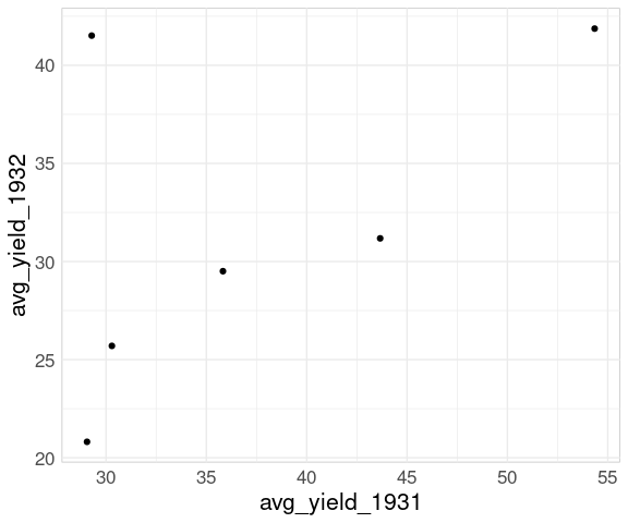
Adding labels using geom_text_repel identifies the Morris site:
p <- p + geom_text_repel(aes(label = site))
p
To recognize the reversal for Morris we can add the 45 degree line:
p + geom_abline(aes(intercept = 0, slope = 1),
                linetype = 2)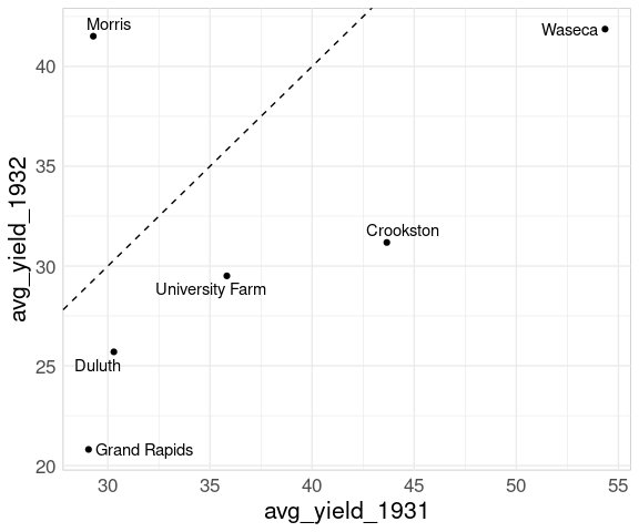
A 45 degree line also helps when viewing the full data:
bw <- pivot_wider(barley,
                  names_from = "year",
                  names_prefix = "yield_",
                  values_from = "yield")
ggplot(bw, aes(x = yield_1931,
               y = yield_1932)) +
    geom_point() +
    geom_abline(intercept = 0,
                slope = 1,
                linetype = 2) +
    geom_point(data = filter(bw, site == "Morris"),
               color = "red") +
    ggtitle("Barley Yields",
            "Values for Morris are shown in red.") +
    labs(x = "1931", y = "1932")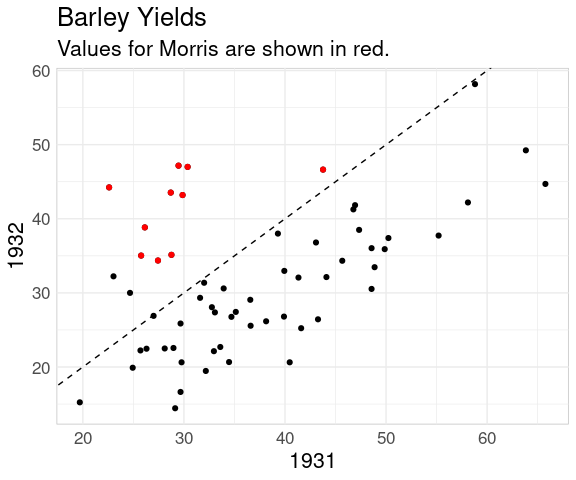
A recent blog post discusses the value of reference lines as plot annotations.
If the primary goal is to show the change from one year to the next then a mean-difference plot is a good choice:
ggplot(wide_barley_site_year,
       aes(x = (avg_yield_1932 + avg_yield_1931) / 2,
           y = avg_yield_1932 - avg_yield_1931)) +
    geom_point() +
    geom_text_repel(aes(label = site)) +
    geom_abline(aes(intercept = 0, slope = 0), linetype = 2)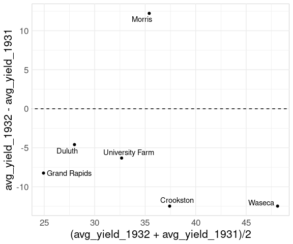
For the full data:
ggplot(bw,
       aes(x = (yield_1932 + yield_1931) / 2,
           y = yield_1932 - yield_1931)) +
    geom_point() +
    geom_point(data = filter(bw, site == "Morris"),
               color = "red") +
    geom_abline(aes(intercept = 0,
                    slope = 0),
                linetype = 2)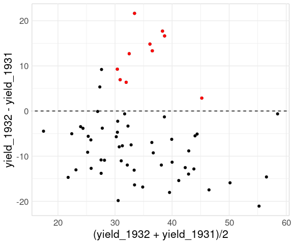
The comparison of changes is now an aligned axis comparison.
Mean-difference plots are also known as
- Tukey mean-difference plots;
- MA-plots;
- Bland-Altman plots.
Plotting the difference against the x variable is also often useful:
ggplot(bw,
       aes(x = yield_1931,
           y = yield_1932 - yield_1931)) +
    geom_point() +
    geom_point(
        data = filter(bw, site == "Morris"),
        color = "red") +
    geom_abline(aes(intercept = 0,
                    slope = 0),
                linetype = 2) +
    ggtitle(
        "Barley Yield Differences",
        "Values for Morris are shown in red.") +
    labs(x = "Yield in 1931",
         y = "Difference in Yield for 1932")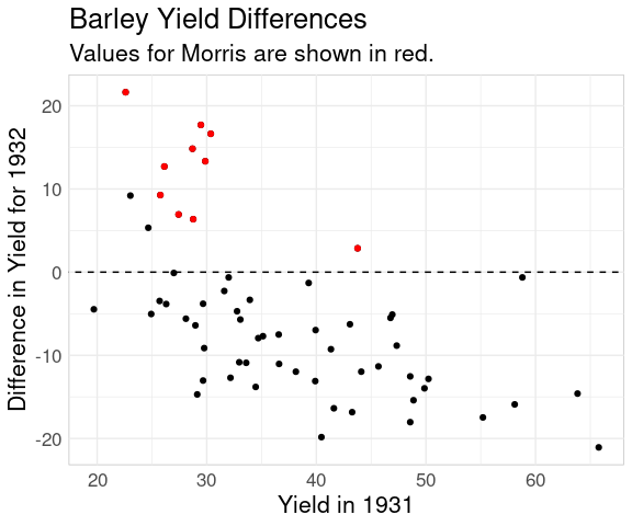
Father and Son Heights
The basic scatter plot:
p0 <- ggplot(father.son,
             aes(x = fheight,
                 y = sheight))
p1 <- p0 + geom_point()
p1
Adding a line with slope one helps identify the regression to the mean phenomenon:
p2 <- p1 +
    geom_abline(
        aes(intercept =
                mean(sheight) - mean(fheight),
            slope = 1),
        color = "red",
        linewidth = 1.5)
p2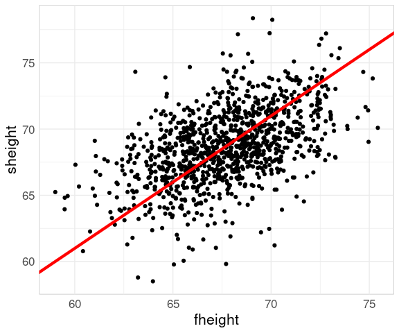
Adding a regression line helps further:
p2 + geom_smooth(method = "lm")
But for showing the regression effect it is hard to beat the scatter plot of sheight - fheight against fheight:
ggplot(father.son) +
    geom_point(aes(x = fheight,
                   y = sheight - fheight)) +
    geom_hline(aes(yintercept = 0),
               linetype = 2)
Old Faithful Eruptions
A scatter plot of the waiting times until the next eruption against the duration of the current eruption for the faithful data set shows the two clusters corresponding to the short and long eruptions:
ggplot(faithful) +
    geom_point(aes(x = eruptions,
                   y = waiting))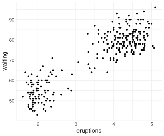
For the geyser data set from the MASS package a plot of the two variables shows a different pattern:
data(geyser, package = "MASS")
ggplot(geyser) +
    geom_point(aes(x = duration,
                   y = waiting))
The reason for the difference is that in the geyser data set the waiting time reflects the time since the previous eruption, not the time until the next one.
For this ordering it is more natural to plot duration against waiting:
ggplot(geyser) +
    geom_point(aes(x = waiting,
                   y = duration))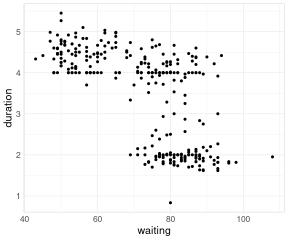
How well does the waiting time predict whether the duration will be longer or shorter?
The question the park service is more interested in: How well does duration predict waiting time until the next eruption?
We can adjust these data to pair durations with waiting times until the next eruption using the lag function from dplyr.
This produces the same basic pattern as for the faithful data set:
ggplot(geyser) +
    geom_point(aes(x = lag(duration),
                   y = waiting),
               na.rm = TRUE)
Reading
Chapter Visualizing associations among two or more quantitative variables in Fundamentals of Data Visualization.
